

Text: Nadezhda Piglova. Photo: Vitaly Nefedov.Stylist: Elena Belova. Architect: Alexander Kravtsov. Designer: Olga Gradskaya. Head of the design studio "Kvadra 7": Mikhail Obukhov. The name "Suprematism" comes from the Latin word supremus, which means "the highest". In the mid-1910s, Kazimir Malevich announced the creation of a new art form, the purpose of which is to express reality in simple forms (square, triangle and circle). Colors also played a role. These artistic ideas found a response in architecture, interior items and even clothing. The design solutions implemented in this apartment are based on the synthesis of the energy of color and form. The color triad of Suprematism consists of red, white and black. But within the framework of our interior, black was transformed into dark gray, and white acquired warm beige shades. The correctly dosed and precisely selected red color in the decoration of the kitchen, dining room, living room and guest bathroom does not cross the boundaries of perception, beyond which negative emotions may arise. At the same time, the unity of tones was strictly observed in the design of all rooms. The basis of the interior geometry is rectangles and squares. They are supported by the volumes of the suspended ceiling and shapes. The result is an original interior that corresponds to modern ideas about beauty and comfort, but at the same time has pronounced roots in the past and aspirations for the future. Suprematism
 Suprematism in Design

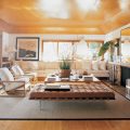
- Photo 1. Living room. Ceiling structures made of plasterboard helped to correct the visual perception of a narrow room.
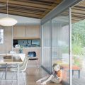
- Photo 2.The graphic nature of the two furniture compositions is emphasized by the contrasting finish. The beige modules on a dark brown background form a balanced counterweight to the second group, where, on the contrary, the dark brown modules stand out on a beige background that merges with the wall. In this case, the furniture composition became the dominant feature of the hall area interior. For this reason, light upholstery, close to the color of the walls, was chosen for the upholstered furniture.
- Photo 3. The fronts of the kitchen cabinets and shelves are made in two colors - dark gray and red. Their beautiful combination is emphasized by the glossy surface of the finish.
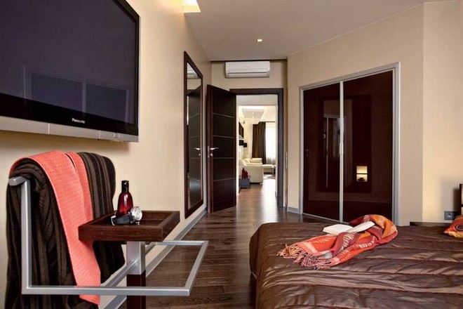
- Photo 4. By building an additional wall in the bedroom at an angle of 135° to the entrance door, the authors of the project created space for a dressing room.
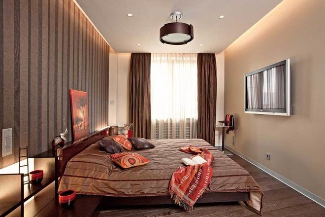
- Photo 5. Bedroom. Two perpendicular planes - the floor and the wall - are visually united by the color scheme.
- Photo 6. Son's room.A calm, neutral color scheme was chosen for the child's room. According to child psychologists, bright objects prevent the student from concentrating during classes. The ergonomics and functionality of the workplace are well thought out.
In a collection of ideas


- The partition between the kitchen and the living room is not interestingonly shape, but also finish. Textured plaster creates imitation wood. This allowed to avoid an ugly junction between perpendicular planes, which occurs when using veneer from natural veneer (photo 1,2).
- The kitchen is connected to the loggia by a French doorwindow, that is, a door glazed from top to bottom. Therefore, instead of wall-mounted radiators, convectors specially recessed into the floor were installed, covered with grilles. The floor convector creates the effect of a "thermal curtain", cutting off the flow of cold air. A removable grille provides access to the heating system if necessary. This option for installing convectors is possible only with a sufficient thickness of the subfloor (screed) and covering, a total of 11 cm (photo 3).
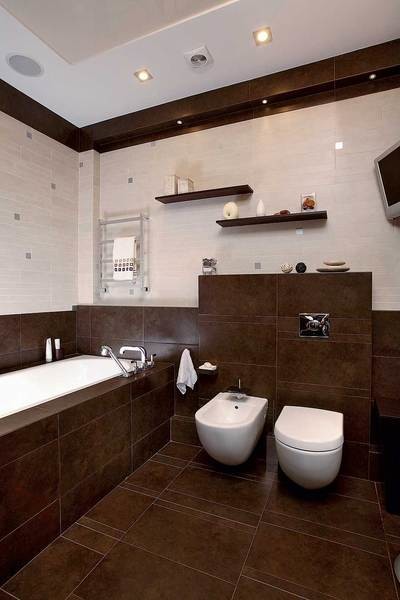
- The interior of the bathroom is built on the gamemultilevel volumes. Wired in the wall installation system of the toilet makes a ledge and comfortable shelves. The ceiling is made three-level. The lower level, like the walls, is tiled, the middle is made of white-painted plasterboard, and the upper one is a tensioning sheet (photo 4).
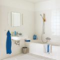
- The furniture in the bathroom is so carefully selectedcolor, shape and style, that it seems impossible to create a more harmonious composition. A separate cabinet and cabinets under the sink made it possible to avoid placing numerous cosmetic and bath products "in plain sight". A noble chic is brought into the room by a perfectly proportioned sink in combination with accessories (photo 5).
Planning solution

 The authors of the project did not aim globally"redesign" the apartment, since the owners were mostly satisfied with it. Only the area of the bathroom and living room was increased at the expense of the hallway. And in the bedroom, thanks to the large footage, it was possible to organize a fairly spacious corner dressing room. They did not add the loggias to the living space. But the glazing of the doors leading to the loggias, "to the floor" visually expanded the space and improved the insolation of the premises. The construction of a partition between the kitchen and the living room allowed us to solve several functional and aesthetic problems at once. Firstly, the excessively elongated shape of the living room was visually corrected. Secondly, partially, but exactly as much as necessary, it was possible to isolate the working area of the kitchen without isolating it.
Interview with the son of the hosts
This time we broke the established order andinterviewed the owners' son, second-grader Saveliy, who amazed us with the maturity of his judgment.Domoy: Were you interested in how the renovation was going?Saveliy: Yes, I often came here with my parents during that time.Domoy: Do you like everything that you've done?– Of course. I like my room the most. It has roller shutters on the window that you can close when you're watching a movie. It feels like you're in a movie theater.Domoy: Wouldn't you like brighter colors: blue or green?– No, I don't like blue and green. I wanted dark brown furniture, like my parents have, but the light color makes the room seem bigger.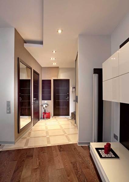


- Photo 1. The boundary between the corridor and the living room is marked in three ways: with a plasterboard partition, contrasting wall paint, and different floor finishes.
- Photo 2. To prevent the living room from appearing too elongated, we used a zoning technique using furniture arrangement. The room was conditionally divided into two parts: a hall and a "home theater".
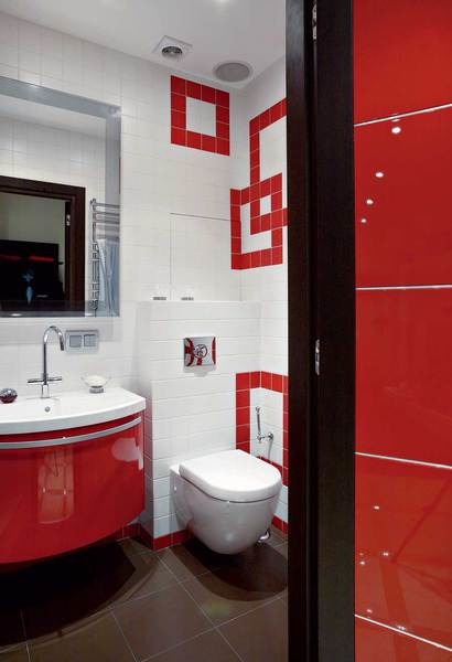
- Photo 3,4.The design of the guest bathroom is based on the spectacular contrast of red and white. The authors of the project successfully played with the shape of the square in different planes, creating interesting intersections of lines with the transition of the pattern from one wall to another. The shower cabin was built directly on site. For this, they used the area of the corridor, which became unnecessary after the redevelopment, while preserving the existing volume of the bathroom.
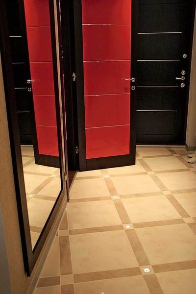
- Photo 5. Light bulbs are built into the floor tiles of the corridor, which serve as "beacons" during the dark hours of the day.
- Photo 6. Built-in lighting is present in both the kitchen and the living room - it gives the ceiling structure additional lightness and visually increases the height of the room.
Entire object
Floor:parquet board made of oak stained to look like walnut, tiles.Walls: plasterboard, paint.Ceiling: plasterboard, paint.Plan before redevelopment:Total area - 138.2 m2,Ceiling height - 3.0 m. Plan after redevelopment: Total area - 138.2 m2, Ceiling height - 2.9 m.
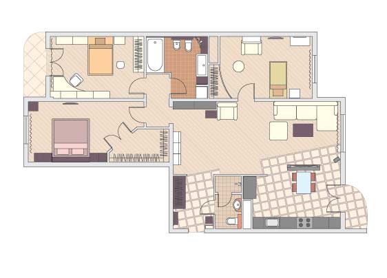 The editors would like to thank the salons La Maison Coloniale, Vellamo, Ka international, Schäfer boutique, «Red Cube» for providing accessories.