Photo: Mikhail Stepanov.From the very beginning, this project promised nothing but trouble. Anna and Lada needed to tidy up a house that had been bought fully furnished and decorated, had served the owners faithfully for ten years, and then had become outdated, both morally and functionally. "There is nothing worse than redoing someone else's work," says Anna. "It is better not to take on such projects at all, but we have been friends with these clients for a long time and could not refuse them." The main difficulty was that the owners did not want to leave their home during the renovation, so dirty construction work had to be kept to a minimum. Decorators made pinpoint strikes where it was absolutely necessary. "Although the house is large, it was arranged in a clumsy manner," says Anna. A lot of space was wasted, and the kitchen was tiny and dark. We had to expand it at the expense of the adjacent room. Or here's another example: before, to have breakfast in the garden, the owners had to make a forced march through the entire house. Now you can get to the street directly from the dining room - we turned one of its windows into a door.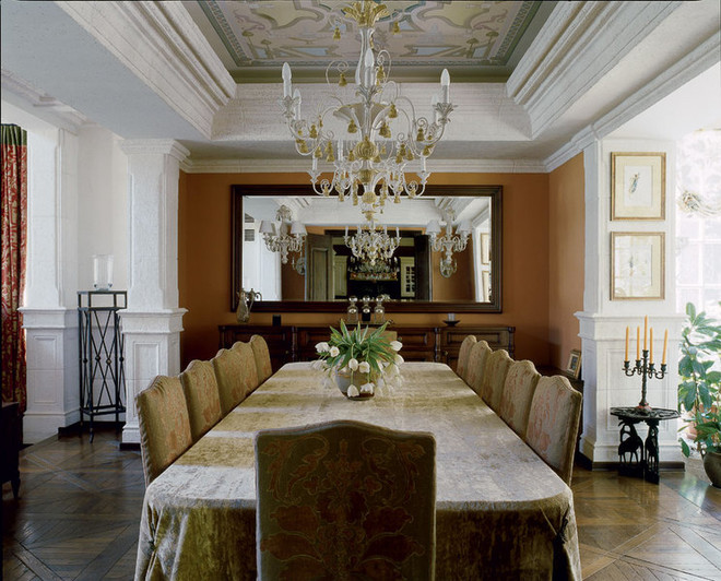 Apartment interior project
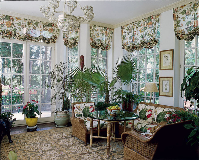
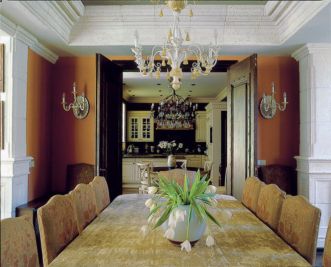 Photo 1 Halogen cornice lighting,which had disfigured the dining room, was dismantled during the renovation. A chandelier appeared under the ceiling instead. All the furniture also had to be replaced. Only the portals decorated with stucco made of white chamotte and on the ceiling remained from the old days. Photo 2 The interior of the winter garden has remained virtually unchanged. The decorators only added a Baker carpet and Romanex Roman blinds. Photo 3 View from the dining room to the kitchen. The construction itself took no more than a month and a half, but overall the process lasted for a whole year. "We had to work in fits and starts: when the customers went on another trip, we rushed to the site and tried to get as much done as possible," says Maria Adrianov, who supervised the project. At the same time, the builders repeatedly disrupted all plans and did not have time to turn around by the time the owners returned. "Such delays are simply inevitable," says Maria Adrianov, who supervised the project. Anna and Maria say in one voice. — There are no ideal builders in nature. By the way, in Russia they are not the worst. Now we are decorating a house in Mallorca - that is a real horror. The Spanish work two hours a day at most, the rest of the time they have a siesta. In comparison with them, our builders are simply angels. However, few people would agree to tolerate the presence of such "angels" in their home. «This story has become a serious test not only for us, but also for the customers, — says Anna. — Put yourself in their place: you go out for breakfast and bump into an unfamiliar man in a construction uniform, who is dragging a sack of cement on his back. In such a situation, you want to kill everyone. And first of all, the decorators! Fortunately, the owners of the house are people with a sense of humor and a philosophical outlook on life. That's why we survived. There were enough difficulties even without the construction. Before the renovation, the house looked like a gloomy knight's castle: an abundance of dark wood, very high hipped ceilings, endless tapestries and black wrought iron chandeliers. Some of the walls were covered with decorative brick. For some mysterious reason, all this splendor was illuminated by halogen lamps behind the cornice, which gave off an unpleasant cold light. The dining room looked especially creepy, as there were no other light sources. The owners were simply afraid to enter this room and ate exclusively in the kitchen. However, the problem was not even in eliminating these "vestiges of the past", but in preserving the pleasing to the eye details, of which there were also many in the interior. "The quality of the finishing in the house was very high," says Anna. "For example, the bedroom was decorated with carved wooden panels, which we simply could not bring ourselves to throw away. We "dissolved" them in the space by tinting them with white paint. It was also decided to keep the wooden paneling of the walls in the study and the ceiling painting in the living room. The presence of such details set strict stylistic boundaries. "We could no longer do anything super-modern here. However, neither we nor the clients had such desires from the beginning. We immediately agreed that a traditional interior would best suit the country lifestyle."
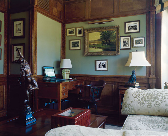
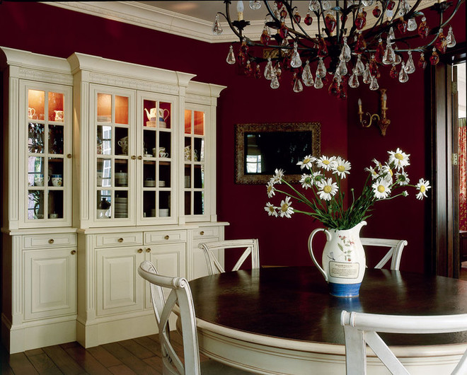
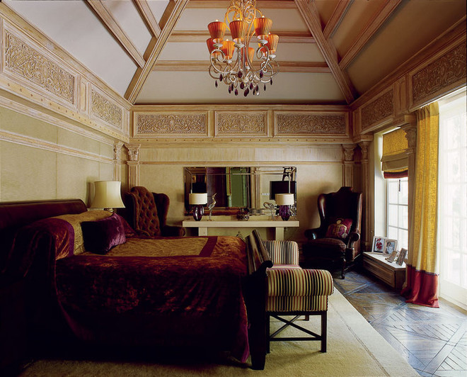 Photo 1 Previously, there wasn’t even one in the officedesk - all the space was eaten up by built-in wardrobes. They were dismantled, thanks to which it was possible to not only equip a full-fledged workspace here, but also to install a fold-out sofa, so now this room is also used as a guest room. Photo 2 A fragment of the kitchen. It is equipped with furniture from Siematic. The sideboard was made in its image and likeness. Around the dining table (also made to order) are chairs from Mis en demeure. Under the ceiling is a Tredici chandelier with colored pendants in the shape of apples and pears. Photo 3 The high hipped ceiling with dark wooden beams made the bedroom look like a well. To smooth out this feeling, the decorators tinted the beams with light paint and lowered the chandelier as low as possible - so that it would distract attention to itself. In the background is a console table from Morelato, lamps Porta Romana, antique mirror from Paris, and Drexel Heritage "eared" chairs in men's and women's versions (the first is upholstered in leather, the second in velvet). There was no disagreement about the color either. Previously, all the walls in the house were white - the decorators decided to change the situation radically. The guest room became olive, the nursery pink and green, and the walls of the kitchen and dining room acquired a rich wine shade. "We used complex natural colors - they perfectly match the nature outside the window and work differently (but always successfully) depending on the lighting. By the way, English colors look especially good here in Russia - because of the similarity of the climate. But in warm countries, the quality of light is completely different, and the colors there are also different - they look great somewhere in the south, but in our conditions they can acquire a monstrous shade»…. In fact, the work in the house is still not finished. The other day, the customers went on another voyage, and the decorators need to quickly tidy up the living room and the second nursery (the family is expecting an addition). The most surprising thing is that the owners are still not embarrassed by life in the renovation. Rather, on the contrary, it inspires them. In any case, the customer has already started taking art history lessons, and in the near future she plans to study to become a decorator. In general, everything is just beginning.
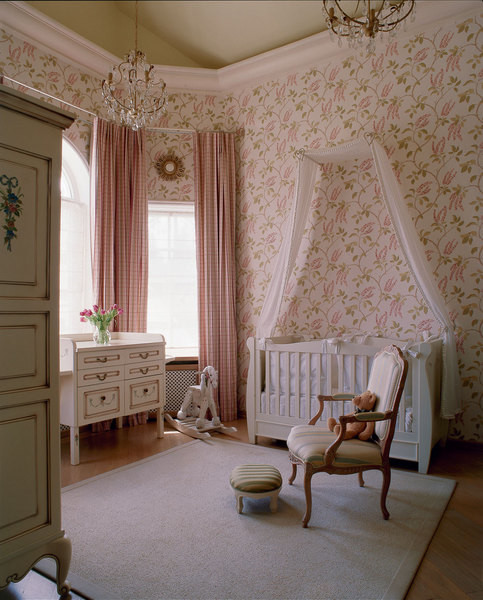
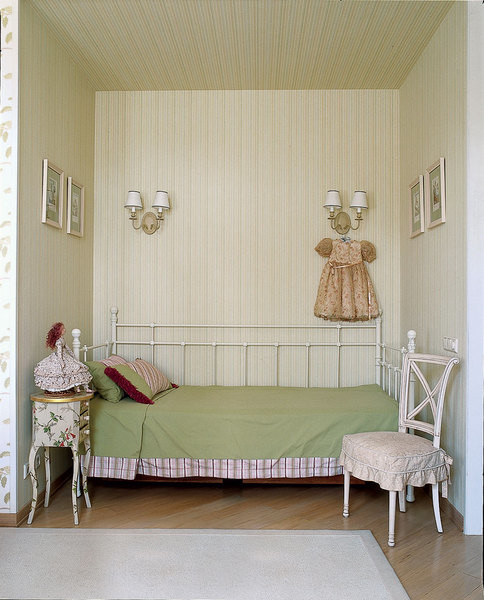
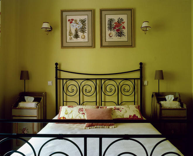
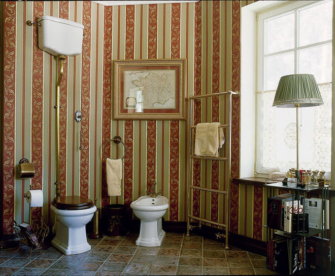 Photo 1 The owners of the house believe that taste should beto educate from the cradle. The interior of the nursery has become a visual aid on the topic of "what is good". The hipped ceiling is painted light green. The walls are covered with wallpaper from Nina Campbell, the windows are decorated with curtains made of Etamine fabric. The changing table is made according to the sketches of the authors of the project. Next to the Theophile & Patachou bed is a G.Galli armchair. The picture is completed by chandeliers from Lucienne Monique and Saladino mirrors. Photo 2 Fragment of the nursery. In the niche, covered with wallpaper from Nina Campbell, there is a sleeping place for the nanny. The bed is from IKEA. Photo 3 The walls of the guest room are painted olive color. The bed is from IKEA. The bedside tables were also bought there, but changed beyond recognition thanks to decorative painting. Photo 4 The area of the bathroom allowed the decorators to turn it into something like an office. The wall painting, imitating wallpaper, was done by Maria Adrianov. The drawing was stenciled and then finished by hand. These items will help to create a similar interior


Making Money with Desserts: Success Stories
Evgeniya Polischuk (Fedutinova) instagram:@evgeniyafedutinovavk.com/janeshomebaking– It all started with baking for family and friends. Gradually, I started posting photos of my baked goods on Instagram – and orders started coming in. I made my first custom-made cake on October 13, 2014, and a little earlier I started making macaroons and cupcakes. You could say that the business “found me”, I am very […]

Soups are cold recipes with photos
Cold cucumber soup with yogurt and lemonsorbet from the chef of the restaurant La Taverna Alexander Zhurkin Photo: Getty Images Ingredients: Plain yoghurt – 125 g Cucumber – 150 g Lemon/lime sorbet – 50 g Cocktail shrimp – 24 g Fresh ginger juice – 1 g Lime juice – 5 g Fresh orange juice – 5 g Parsley – 1 g Pink pepper – 1 g Watercress – […]

barbeque kebab
Pork tenderloin in glaze Photo:Dmitry Bayrak/dbstudioPreparation time: 20 minutes + marinating time.Calories: 454 kcal per serving.For 4 servings: 4 pork tenderloins (approximately 300 g each), 1 onion, 2 cloves of garlic, 1 tsp. lemon zest, 1 tsp. lemon juice, a pinch of ground cumin, coriander and turmeric, 1 tbsp. vegetable […]

Pierre Duacan: dietary recipes: Ducane diet
Beetroot soup Photo:Season’S, Luxury Hotels RepresentationYou will need:· Boiled beetroot – 60 g· Fresh cucumbers – 20 g· Red radish – 20 g· Green onions – 10 g· Egg – 1 pc.· Drinking mineral water – 200 g· Salt – 1 gPreparation:· Boil the egg and beetroot.· Grate the cucumbers, radish and part of the beetroot. Put everything […]


