Stock Foto VITALIA NEFEDOVA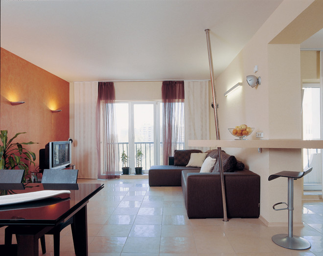 Two-storey apartments
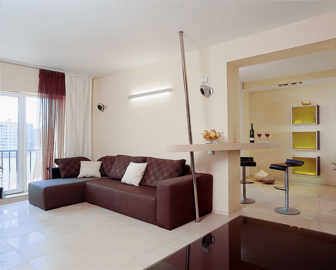
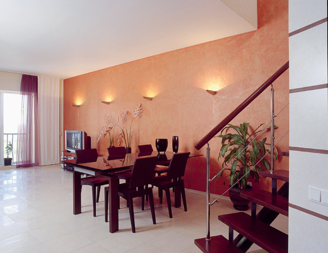
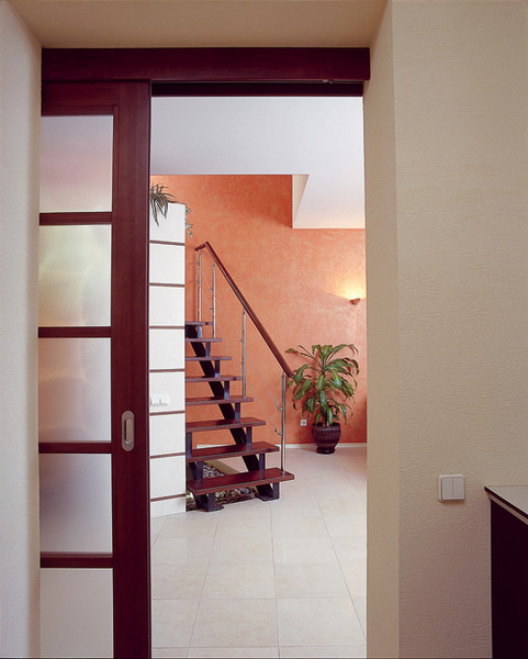 Photo 1. Living room.The space of the first floor looks light and free. The presence of contrasting colors brings diversity and rhythm to the space. Polished and matte porcelain stoneware slabs with processed (rectified) edges are laid in a checkerboard pattern on the floor. Photo 2. By installing a metal counter at an angle to the bar countertop, the architect deliberately introduced a slight dissonance into the rectangular space. Photos 3, 4. Dining room. One wall of the first floor in the dining area is finished with orange decorative plaster with a mother-of-pearl effect. This large plane can become an excellent background for any objects. But at the same time, it can perfectly exist on its own, enriching and decorating the interior. The nuances of the textured surface, reminiscent of tree bark, look especially impressive and play with all their shades in the light of four miniature sconces. Layout solution
 The original layout of the apartment as a wholesatisfied both the owners and the architect. They especially liked its two-level solution, thanks to which it was possible to convincingly separate the public and private zones. And yet some things had to be rebuilt, mainly in order to open up the space as much as possible. On the first floor, organized according to the studio principle, non-load-bearing partitions were removed, combining the kitchen, living room and hall-hallway. In addition, the configuration and location of the leading to the second floor were changed. From a massive structure of an extremely simple linear form, it turned into an original style-forming and decorative element of the interior, perfectly coping with its main task. The area of the second floor, where the bedroom, study and bathroom are located, was increased due to the loggia adjoining the study. Having pre-insulated this volume, they gave it over to a winter garden. The clients, a respectable married couple, found the architect on the recommendation of friends. In their recently purchased two-level apartment with a total area of 110 m2, the spouses wanted to see a spacious area for receiving guests, an office for concentrated work, and a room for rest and sleep, isolated from the noise and bustle. The two-level layout of the apartment suggested the idea of dividing the floors "by interests". The architect proposed to create a public studio-type area downstairs, and organize a private space with three isolated rooms upstairs: a bedroom, an office and a bathroom. The clients really liked this idea. It remained to decide in what spirit to maintain the interior, having previously decided whether to adhere to the framework of a certain style. After discussions, they came to the conclusion that it would be most reasonable to create a modern interior that would correspond to the character of the city and at the same time have individual features. As a result, the modern look of the housing was acquired thanks to the laconic forms of furniture, and an urban shade and individuality were given to it by technocratic structures made to order according to the architect’s sketches (stairs, bar counter, wardrobe in the hallway) and “rigid” materials (metal and porcelain stoneware).
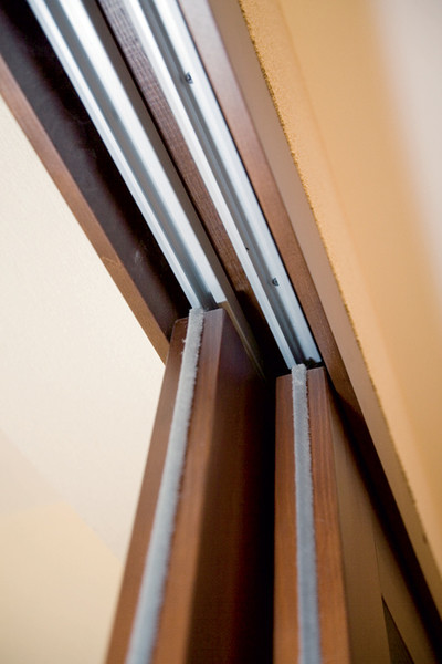
 The thickness of the partition made it possible to hide it from viewsliding door guides. The bar countertop was made on site. First, a metal frame was built tied to the wall and a metal counter was installed. Then concrete was poured into a plasterboard form built according to a template. The top of the countertop was faced with acrylic Corian stone (12 mm), and the bottom was simply painted. The owners are very sociable people, so they paid special attention to a well-thought-out area for receiving guests. They insisted on a large number of corners for relaxation and friendly conversations. A studio layout was better suited to solving this problem than any other. To organize it, they got rid of almost all the internal partitions. And they made another opening in the wall, thus combining the kitchen, living room and hallway. Finally, the first floor furnishings include numerous places where guests can comfortably gather: a sofa, a bar counter, a dining table, seats around the peninsula in the kitchen, and the steps of the stairs. The abundance of white in the decoration of the walls, ceilings and floors, the accent addition of orange, as well as the absence of bulky items and random accessories - all this visually lightened the space of the public area. The underfloor heating system used to heat the first floor (ceramic granite is laid here) made it possible to remove radiators from the walls and replace the usual windows with panoramic glazing. The hallway was designated very conditionally, installing a large wardrobe opposite the front door. By the way, this wardrobe is the only one on the first floor. All other storage systems were moved upstairs. The interior of the second floor was created for the personal life of the owners. The idea of urbanism is considerably diluted with an environmental theme here. For a pleasant tactile sensation, the floor is covered with cork. Natural materials predominate in the furniture finishing, and natural textures in the interior design.
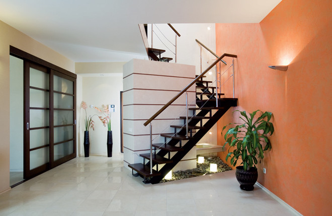
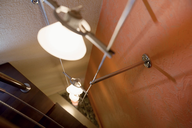
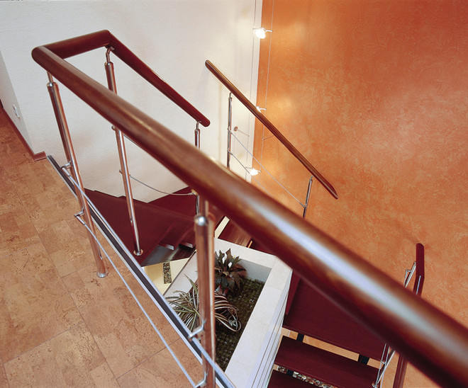
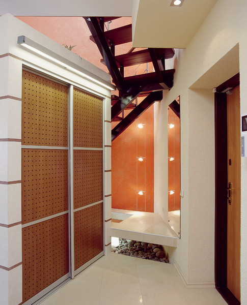 Photo 1.The horizontal lines set by the steps of the staircase are supported by the decorative layout on the wall of the wardrobe and the slats of the sliding doors separating the kitchen from the hallway. Photo 2, 3. The lamps fixed on the vertical strings illuminate the staircase along its entire length. On the one hand, this is a function, on the other - decor. Soft matte light is also quite suitable for night time, so the lamps are usually left on until the early morning. Photo 4. Hallway. The wardrobe in the hallway is made of plasterboard on a metal frame and performs many functions: it is a partition between the hallway and the living room, serves as a place to store outerwear and other things, exists as an expressive piece of furniture and works as a compositional element paired with the stairs. To the left of the wardrobe, the architect made a podium on which it is convenient to put a bag or sit down to change shoes. Initially, the stairs looked completely different - traditional, massive, with balusters. And it was located on the territory of the hall-hallway. The architect changed not only its design, configuration and appearance, but also adjusted the location. Now the staircase belongs to the living room area and together with the under-stairs space, where a unique rock garden with lamps was arranged, is perhaps its most important decoration. The open metal structure made of channels and corners without handrails cost 150 thousand rubles.
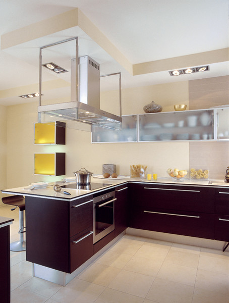
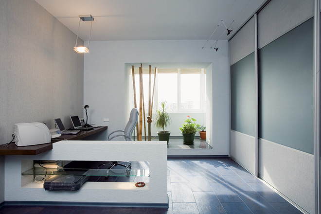
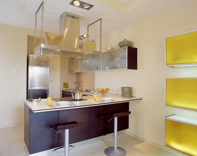
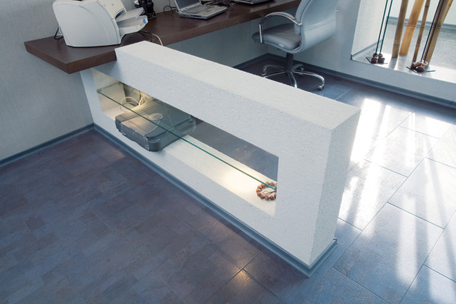 Photo 1. Kitchen.The advantage of a peninsula kitchen is that it forms an ideal working triangle: stove, sink, and refrigerator. So, you won’t have to rack up the mileage while cooking. Photo 2.4. Study. The study serves as a home office for the owners. All the equipment needed for work can easily fit on the long table, made according to the architect’s sketches from concrete, glass, and wood. The rest is stored in a huge built-in closet. Photo 3. Rational kitchen style – the hostess’s choice. The main criteria when purchasing furniture were technology and ease of use. Wanting to give the home office an informal look, the architect and the owners decided to forego purchasing ready-made furniture in favor of custom-made furniture. According to Konstantin Stefantsov's sketches, they made a table formed from a solid tabletop (glued plywood) and a base in the form of a concrete structure. It has a through opening with a glass shelf and lighting.
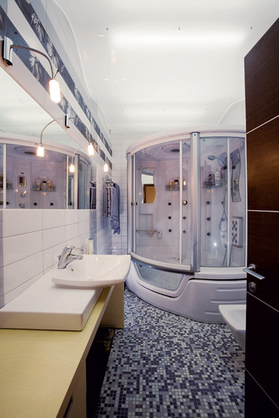
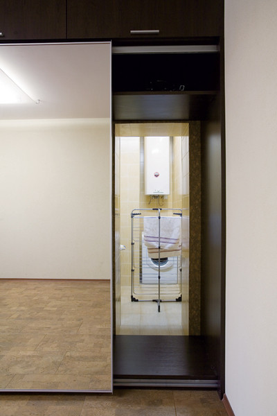
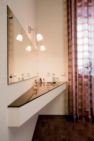
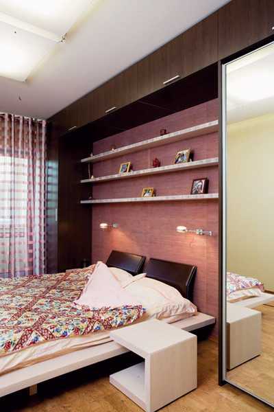 Photo 1. Bathroom.A small bathroom seems much more spacious due to the horizontal line of mirrors and the voluminous, but light suspended ceiling. Photo 2. Laundry. The entrance to the laundry room was masked by a mirrored door from the cabinet installed in the bedroom. It turned out that you can literally enter the laundry room through the cabinet. Photo 3. The first floor is equipped with a heated floor system. The control panel allows you to adjust the temperature, as well as turn on the heating at any time of the year, as needed. Photo 4. The first floor is equipped with a heated floor system. The control panel allows you to adjust the temperature, as well as turn on the heating at any time of the year, as needed.
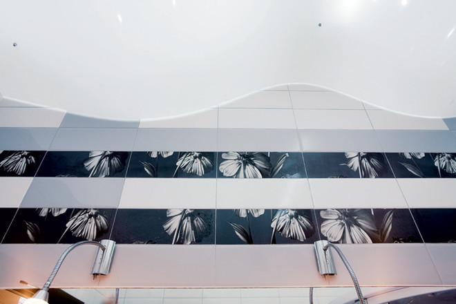 The only suspended ceiling in the apartment is installedin the bathroom. This is an unusual design. It is a wide wave-shaped strip of milky acrylic glass. Daylight lamps were chosen for lighting. Interview with the owner “This is the first apartment we made exclusively for ourselves, since the children now live on their own. Konstantin and I discussed various furnishing options, from ultra-avant-garde to completely conservative. We had a lot of wishes. Konstantin helped to bring them to life. For example, I don’t like overhead lighting and, of course, I told the designer about it. He came up with a lot of original lighting solutions and proved that you can do just fine without chandeliers. Another wish of my wife and I was to create a comfortable space for receiving guests, which was also successfully fulfilled. Previously, we received our many friends in a small kitchen, at one table. In this apartment, Konstantin suggested giving the entire first floor over to the public area, and we liked the idea. Despite the relatively small area of the lower tier (about 60 m²), we can now host dozens of people. And everyone finds a place to their liking. Some guests sit on the sofas, others at the bar, others on the loggia, etc.
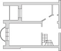
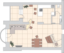

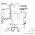
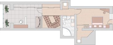 Photo 1 (1st level), 2 (2 nd level). Before re-planning. Before re-planning
Explication after redevelopment First level
Second level
Photo 3 (1st level), 4 (2nd level). After redevelopment. Kitchen
Bathroom
Bathroom
Bedroom
Hallway, living room
Cabinet
Architect KONSTANTIN STEFANTSOV (Novosibirsk)Text by NATALIA ALEXEEVA
