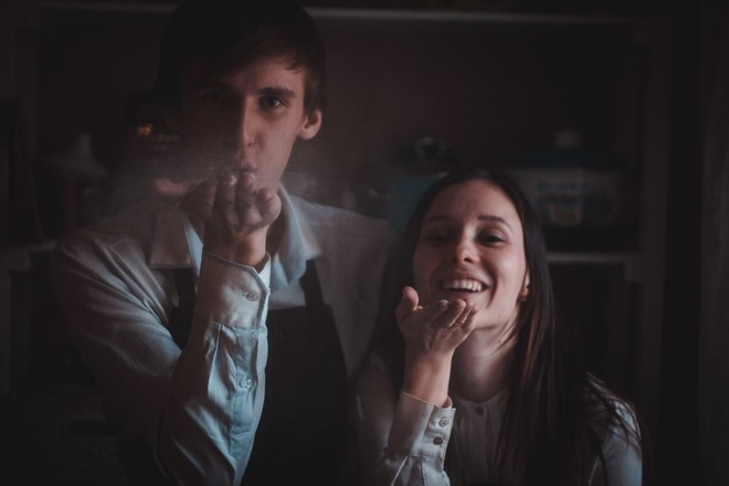
Photo: Timofey Izotov Max Studio Stylist Marina Bessonova Assistant Larisa Doronina Combination of colors in the interior photo
 Photo 1, 2. Album Art DОco, publishing house The Pepin Press (CD with files for large-format printing is attached). Bookshop "Moscow", 1 200 rub.Photo 3. Lighting Spun Light, Flos, salon "Twelve", 27 930 rub. Vase, show-rooms Roshe Bobois, 120 cu The fact that poems grow from all sorts of rubbish, we remember from school, but, strangely enough, about the interiors you can say the same thing. The image of space is sometimes born from the most unexpected things: someone's bright cloak, accidentally snatched from the crowd, sky-blue tiles in the last film of Almadovar, a piece of ripe melon on a plate, a ray of sun falling on a white sill ... This time the starting point for the stylist Marina Bessonova became a geometric ornament, which she accidentally found in the album Art DОco among samples of wallpapers, postcards, textiles and wrapping paper of the Art Deco era. The editions of this series of The Pepin Press are accompanied by disks, in which all illustrations are duplicated in digital format, so that any of them can easily be transferred from the pages of the book to life. For example, as Marina did, making custom wallpaper with a favorite pattern. In general, the combination of green, brown, yellow and black colors is a win-win combination. It is guaranteed to "cling", because it is rented from nature. The right shades can be peeped in any park, the benefit of autumn is now in full swing: the darkened from the rains greens and golden-yellow foliage - that's exactly what is required. To shade a complex picture of the wallpaper and make it more readable, the old linoleum on the floor was painted green. In addition, green acts soothingly. An important point - a special paint for linoleum with a strong glossy gloss gives the space depth, which is especially valuable in small rooms. Now about furniture and accessories. First, there should be few of them - otherwise nobody will see your beautiful walls. Secondly, avoid too complicated and intricate forms, because they will argue with the wallpaper design. Third, try not to deviate from the main palette. The clearest black silhouettes will look best on this active background. And the last tip: if you are not completely sure that you can easily get along with the "geometric" walls and shiny floor, use our palette to decorate the corridor or hallway. Passage zones - an ideal platform for experiments, because here long do not linger, but because even the most risky decor does not have time to get bored. In addition, these rooms are often in the position of poor relatives - they look sober and sad, so energy charging will not hurt them.