A Good StartAs they say in novels, nothingforeshadowed a storm. At first, everything was going very well. The Old Palermo area, where the Argentine couple decided to settle, had long been a favorite of the local bohemians, and you simply couldn’t think of a more suitable place for creative people. Not to mention the house itself! Koti and Andy liked it at first sight. A high hedge covered with ivy hid the two-story “box” with two glass walls from prying eyes. The six-meter windows created a feeling of extraordinary lightness and transparency, erasing the boundary between the living room and the courtyard, where a swimming pool and a small outbuilding were located in the shade of palm trees (“An ideal place for a home studio!” Koti immediately decided upon seeing this building.) The previous owners left the house in excellent condition, so it did not require major repairs. Coty and Andy only renewed the paint on the facade and redid the garden paths, replacing the gravel with concrete. But they were still a long way from moving in. The Truth of Life “Creating a cozy interior not for filming, but for yourself, is not that easy!” Andy and Coty work in the advertising business and know how to create a space that looks perfect on camera. They expected that this experience would help them furnish their new home, but they were wrong: “We quickly realized that completely different laws work in real life. It turned out that creating a cozy home not for filming, but for yourself, is not that easy!” The only thing that was not a problem was the color scheme, because it was dictated by nature itself. To emphasize and shade the bright vegetation outside the window, the previous residents painted the rooms a pale green shade. The new owners didn't change anything. "The walls looked great, so we decided not to experiment," says Koti. But when it came to furnishings and the time came to have their say, the couple hit a dead end. The few belongings Andy and Koti had accumulated in their previous lives were only enough to furnish the studio in the outbuilding with great difficulty: "Although these things weren't so bad in themselves, they definitely didn't want to get along with each other." But that's not the worst of it - the couple had to practically design the interior of the house from scratch.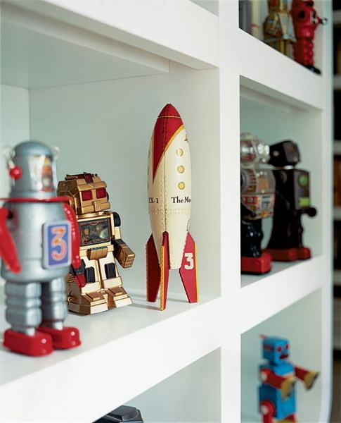 Cozy interior
 Cozy apartment interior
- Open shelves are the best place to display trophies. This rack, made according to the owners' sketches, displays a collection of robots and plastic toys brought from Tokyo.
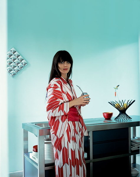
- The mistress of the house Kochi Largua in the kitchen. As in the whole house, this room is infinitely dominated by a light green color.
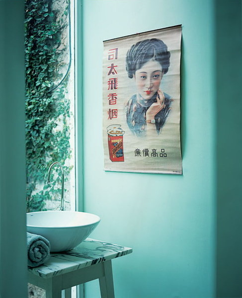
- The surrounding landscape bursts even into the bathroom. A riot of greenery outside the window balances the laconic marble base and the sink in the form of a bowl from Philippe Starck. A poster on a wall originally from China.
Starting pointIn Russia, people usually dance from the stove— that is, from what is already available. Koti and Andy decided to do the same: if the issue with the walls is resolved — then it is necessary to start with them. Moreover, the Argentine couple had a wonderful collection of paintings in the pop art style. The exhibits took their places on the walls, but it turned out that this is where the similarity in the spouses' views ends and continuous disagreements begin. Koti wanted to design the interior in a minimalist style, and her husband actively «lobbied» for the design of the 60s. Both options were justified: high ceilings and huge windows — the ideal background for strict modern furniture, and the idea of filling the house with cult objects of the mid-twentieth century was suggested by the artistic design of the walls. The spouses almost had a falling out, but still managed to find a compromise.
