Project author Vladimir BudilskyArchitect Anastasia PlautinaStudio design “Maslova Pier” Construction Mikhail Egiyan, Marina Zelenskaya (“STM-Stroy”)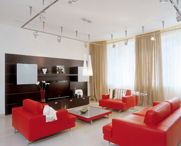 Design red white

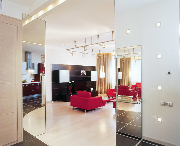
- Photo 1. Living room. Despite the graphic and strict forms of furniture, the interior gives the impression of a calm and cozy. The sofa group of juicy red color clearly stands out against the light background and from the first moment it creates a positive attitude.
- Photo 2.3. Lighting. A very original solution was found for lighting the apartment. There is no heavy pile of chandeliers on the ceilings, but only a light modern design with lamps in the living room.
- Photo 4. Hallway. An unusual effect creates a system of mirrors at the entrance to the apartment. Cross reflection allows you to immediately cover the entire space.
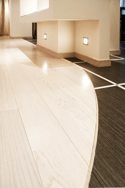
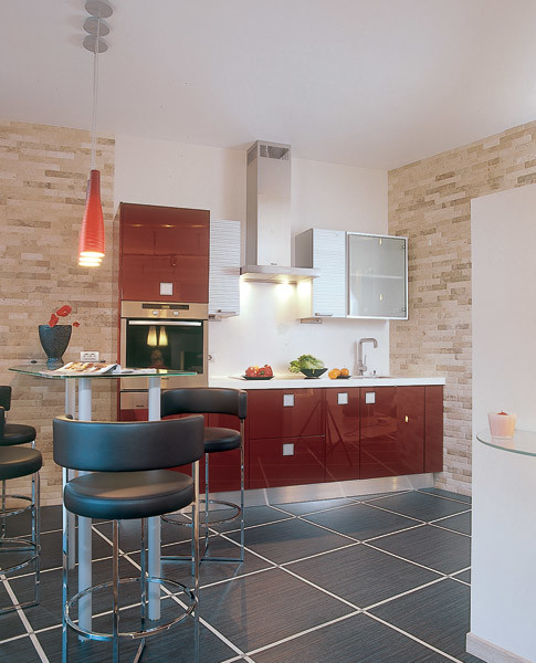
It is believed that the character of a person influences the choiceshades of clothing and interior colors. The hostess immediately said that she loves light colors. And although there is enough light in the apartment, I would prefer to enhance this feeling due to the almost white color of the finish. Finishing materials were selected so that they change the shade depending on the lighting (whether it is daylight or electric). The lifestyle of the married couple - two working people - in many respects determined the priorities that were taken into account when creating the planning. The main attention was paid to full and pleasant rest. The result was a spacious living room with cozy sofas. Moreover, the red color of upholstered furniture (the only bright accent in the interior) as if declares its important role in the house. But they decided to make the kitchen small. After all, for the hobby of cooking the hostess often does not have enough time, especially since you can eat tasty food in a cafe or restaurant. For the same reason, the kitchen table was replaced with a bar counter designed for four people. That is, all the conditions for the owners to invite friends and to spend an interesting evening with them are available in the apartment. The feeling of peace and harmony is achieved through unusual lighting at home. There are almost no familiar chandeliers or sconces. A soft glow spreads out from under the false ceiling, where fluorescent lamps are placed, and from built-in halogen lamps flickering on the walls. A well-designed system of large mirrors in a small hallway is designed to not only increase the space, but also reflect the interiors of the kitchen and living room. We can say that, standing on the threshold, you immediately see the whole apartment. And all your problems immediately retreat ... Planning solution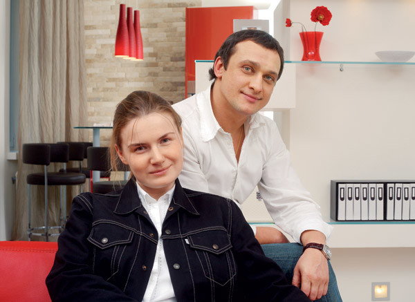 The main task in the development of planningthe apartment was the organization of the most convenient and aesthetic housing. The decision to create a democratic open space architect and customers adopted unanimously. As a result, a total volume was formed, including the entrance hall, living room and kitchen. But only the bedroom and the bathroom remained isolated. Since the layout determined some graphical forms of the interior, it was decided to soften the corners with rounded lines. The radial front wall with glazing set the same outlines to a fragment of the opposite wall, on which, for greater expressiveness, they applied a decorative textured surface with a “rain” effect. Also, the radial forms are supported by the curvilinear joint of the floorboard and tiles. The partition between the living room and the kitchen was decided by many planning tasks at once. The design hides from the eyes the working area of the kitchen (only a beautiful bar counter is visible), a refrigerator is built into it, and at the same time it is a real decoration of the interior.
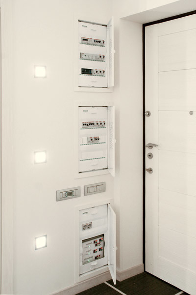


- Photo 1.2. Halogen bulbs are built into the hallway wall, the brightness of which can be adjusted. When it decreases, the impression is made of lit candles.
- Photo 3. Bathroom. The walls are covered with decorative plaster, the reliefs are made by hand. The resulting pattern creates the impression of tiled lining.
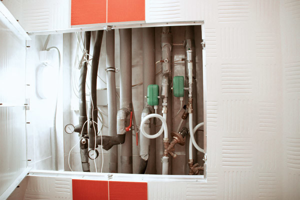
- Photo 4. In order to facilitate the maintenance of the apartment’s life support elements, the niche where the risers and water supply equipment are located (taps, pressure reducers, leakage prevention equipment, etc.) was tiled and backlit. It turned out very aesthetically and neatly. So I want to once again look and check whether the systems work correctly.
- To protect the electrical network of the apartment fromoverload, the system of electricity consumption is thought out to the smallest detail. For example, when you turn on the kettle, the floor heating is automatically interrupted. After all, while the kettle is boiling (you need only a few minutes to do this), the floor does not have time to cool down.
- The air conditioning system is located behindsuspended ceilings, making it completely invisible. And at the same time, it is easily accessible thanks to removable ceiling panels in the bathroom. And decorative ventilation grilles built into the walls allow air to flow.
- To organize a single space andTo maintain the given style, the corner of the wall protruding into the hallway was finished with a mirror, which visually created the effect of a column. Moreover, the internal volume of this element remains a useful part of the built-in wardrobe.
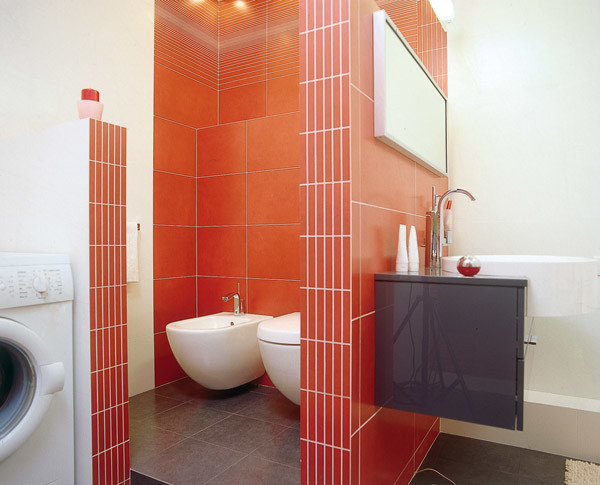
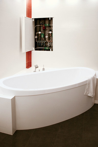
- Photo 1.2. The walls of the bathroom are made of bricks and tiled. One such wall separates the bath from the toilet and serves as a support for the sink and bedside tables. The other forms a niche for a washing machine.
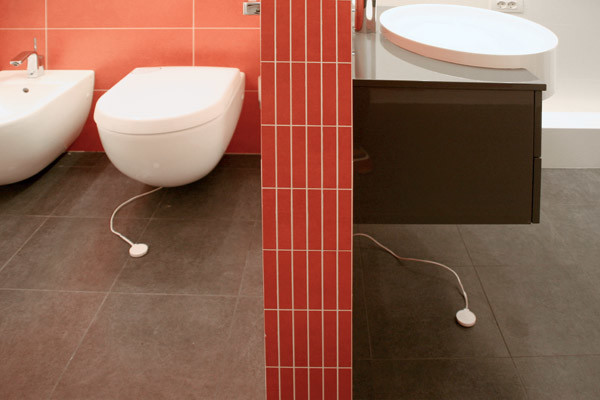
- Photo 3. Water sensor.
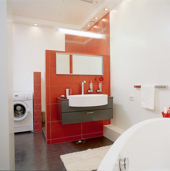
- Photo 4. Bathroom. The bathroom has a two-level suspended ceiling made of moisture-resistant drywall. The luminaires built around the perimeter provide the room with quite bright lighting.
Interviews with the hosts "Working with the architect and the builders was onepleasure. Relations have developed trusting, warm, always managed to reach mutual understanding. Everything that you see here was done by mutual agreement with Vladimir Budilsky: he offered something, and I most often agreed. And I did not feel any pressure from him. Vladimir also suggested adding a bright red color. At first I began to doubt. I could not understand what would happen in the end, whether it would not be too bright. But now I can say with confidence that I really like everything in this apartment. The architect decided to dissolve the lonely column in the interior very gallantly. For a start, he invited me to a cafe and put me near a column lined with mirrors. And then he offered to imagine what it would look like in our apartment. I presented - and agreed to such a decision. The builders worked very neatly and harmoniously. Nothing had to be redone and customized at the final stage. I was pleasantly surprised that there was no dust in the process. Whenever I came to see how things were going, everything always looked neat. Such high-quality construction work is extremely rare. In our previous apartment we did repairs and had an idea of all the problems that he could create. But in this case, only pleasant memories remained of communication with the architect and with the brigade of workers. And the result is absolutely arranged for us. It is a rare case when repair doesn’t bother, but pleases! ”“ We have certain principles, ”say Mikhail Egiyan and Marina Zelenskaya. - For accuracy in work, and for comfort at the facility should always be light and clean. We achieve this by using a vacuum cleaner and illuminating the space to the maximum. It would be desirable for the landlord to move into it was not a headache, but a pleasant solemn event. And, of course, we try to think as much as possible the technical equipment of the home. In this case, besides other automatic systems, they installed leakage protection. Sensors lying on the floor are triggered for 40 seconds, after which all taps automatically overlap and a beep sounds. ”
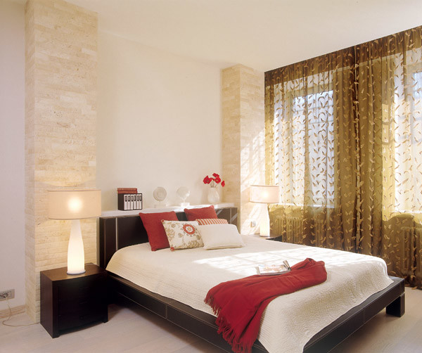
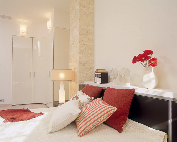

- Photo 1.2. Bedroom. The walls of the bedroom are covered with decorative plaster. Moreover, the texture of its surface appears only in bright daylight and pleasantly surprises.
- Photo 3. In order for the shape of the wall to coincide with the curvature of the cabinet doors, the builders specifically went to the company where they were ordered and made precise patterns. There are sconces above the cabinet. They are hung unusually high and quite adequately replace the ceiling light. The main lighting of the bedroom is provided by halogen lamps hidden behind the suspended ceiling.
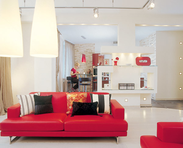
The most complex and interesting element of the interior -partition separating the kitchen area from the living room. This is a monolithic concrete structure. Unusually shaped, specially illuminated, it makes a pretty strong impression. (Note that the device of the set of niches and lighting required exact calculation and meticulous execution of all the works.) From the living room, the partition looks like a fireplace.
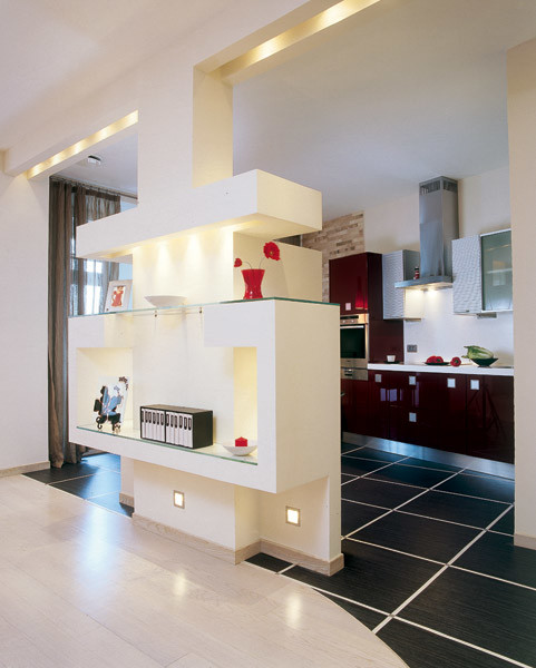
- Photo 1. Rectangular shapes of mirrors and shelves, squares of lamps and tiles create a beautiful geometric composition in the interior.
- Photo 2. The luminaires built into the lower part of the partition visually facilitate the construction. And their reflection in the smooth surface of the floor draws attention to the beautiful radius line connecting the floorboard and tile.
- Photo 3. Kitchen. The lamps are arranged so that only the working areas of the kitchen are lit. The bar counter, replacing the dining table, saves space and refines this utilitarian territory.
- Photo 4. If you decorate the “portal” of the partition with burning candles, it will look like a real fireplace.
The editors would like to thank Samsung for the equipment provided.Text by Olesya SklyarPhoto by Vitaly NefedovStylist Elena BelovaNext you will find a review of popular
