Text by Alexei ZemskyPhoto by Yevgeny Luchin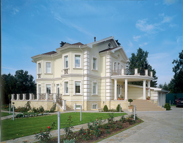 Interior style of a country house
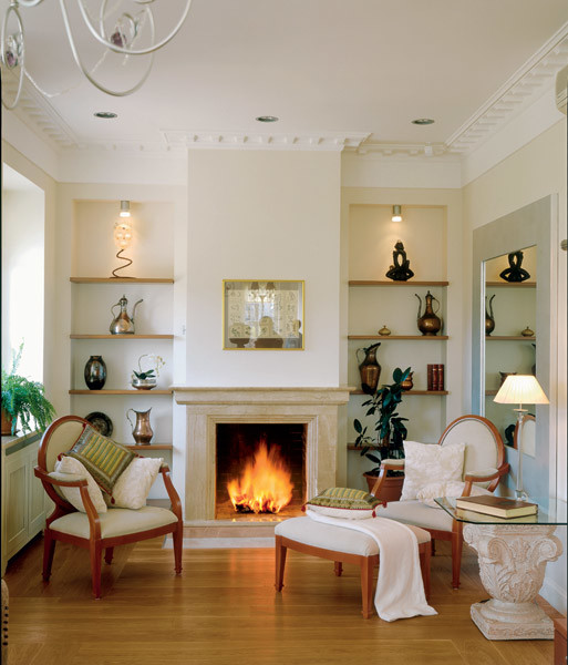
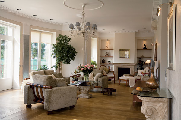
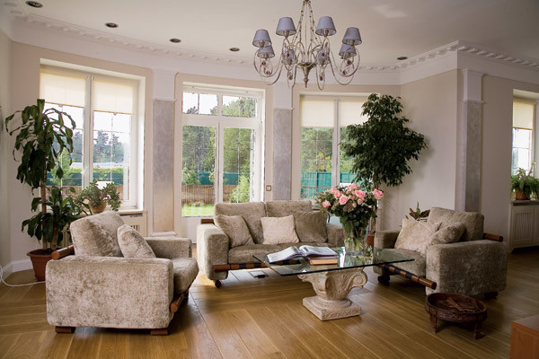 Photo 1. House from the outside. Photo 2. Fireplace.Initially, the fireplace had a protruding, square in section, chimney (50x50 cm). In order to visually change its proportions, wooden shelves for souvenirs were arranged in the side niches and lighting was installed. To visually expand the narrow space of the fireplace area, a large mirror in a wide silver frame was hung opposite the window (Viktor Krylov's Carpentry Workshop). The fireplace portal is finished with marble. The firebox is made of fireclay bricks. Bakokko furniture (Italy). Photos 3, 4. Living room. Flexform upholstered furniture (Italy), a stone table and console in the form of capitals, as well as Poliform cabinet furniture (Italy) were taken from the old apartment. The sofa and armchairs were updated. Instead of the old Alcantara (artificial suede), they were covered with chenille at the Brand factory (Moscow). Silver chandeliers Baga (Italy) were selected in combination with the color of the pilasters. What to do if you are moving to a classic estate, and modern equipment and furniture are expensive in the literal and figurative sense of the word? There is only one solution - call an architect and try to combine the incompatible! In this house, the right atmosphere was created by skillfully placed accents.
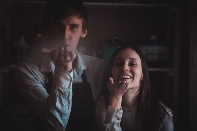
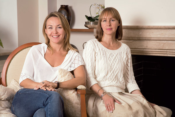 Often, an architect says in an interview thatbecame friends with the owners of the house. There is no doubt about it. After all, truly successful interiors are only created when the architect is on the same wavelength as the client. But the opposite is also true. This interior would not have survived a day in its original form if the owner, Inessa (pictured left), had not accepted and treated with care the carefully thought-out concept of the architect, Elena (pictured right). Moreover, all decisions regarding the interior decoration were made jointly. Therefore, we have no doubt that the authorship of the interior belongs to both ladies. We should add that during the filming we did not violate the real furnishings of the house by an inch, and you can see for yourself our words. The stone fireplace mantel, ceiling cornice, pilasters between the windows and elegant furniture refer us to the classical tradition. These elements stylistically linked the interior of the room with the facade of the house. However, they are also presented in a modern spirit. For example, the pilasters are finished with silver material, which echoes the shiny metal surfaces of the built-in kitchen appliances and the huge side-by-side refrigerator. The ceiling cornice acquires a modern look thanks to the rhythmically located modern Wever & Ducre (Belgium) lamps along it. During the implementation of the project, some components were replaced with less expensive ones. Thus, it was decided to order elegant interior doors from the Moscow factory Iskra-M (24,000 rubles each). Instead of a designer bathtub from Philippe Starck, they chose an equally high-quality Spanish analogue for less money (the Taus Line model by System pool, 90,000 rubles). The production of a luxurious mirror by the fireplace was entrusted to Russian carpenters (45,000 rubles).
Information
- Construction of the house "Southbrook".
- Interior decoration "Master-stroy"
- The foundation is a monolithic strip foundation, 2.7 m deep.
- Brick walls (380 mm) with façade insulation (120 mm) using Texcolor technology (Germany).
- Monolithic reinforced concrete floors.
- The roof is made using a wooden rafter system made of soft bituminous shingles Tegola (Europe).
- Boiler house Buderus (Germany).
Layout
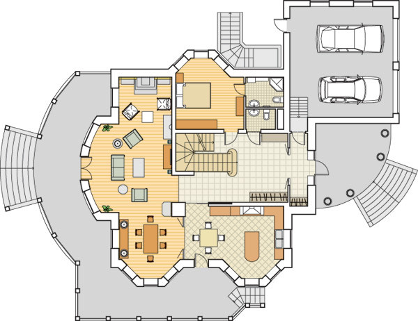
One of the projects proposed by YuriMogilevich specially for the cottage village, was chosen by the owner and redesigned according to her wishes. Since the house was originally designed with an "open layout" (with a minimum number of internal load-bearing structures), making changes was not difficult. Thus, as a result of creative revision, a third bay window appeared, which later housed a dining room, and on the second floor, part of the hall was turned into an office. These changes were naturally reflected in the facade of the building. However, despite the fact that the house now looks like a large festive cake, it does not "fall out" of the general style of development of the village, set from the very beginning. The only thing that could not be changed in the building's structures was to remove the load-bearing pylon on the first floor. Elena Velkhli successfully played it up, turning it into a rectangular column with the help of plasterboard sheathing. The sheathing hid vertical communications and a case for a sliding door. House project by architect Yuri MogilevichInterior design by architect Elena VelkhliCurtain design by decorator Tatyana Ivanova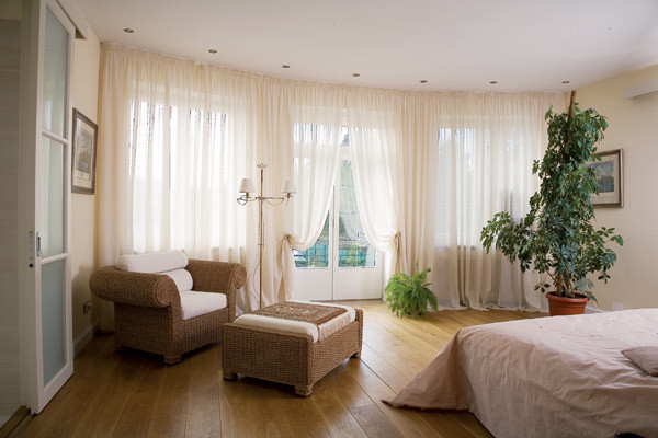
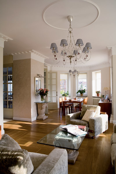
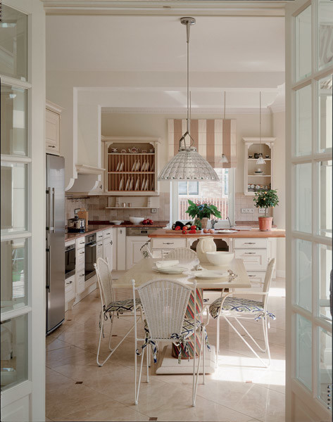
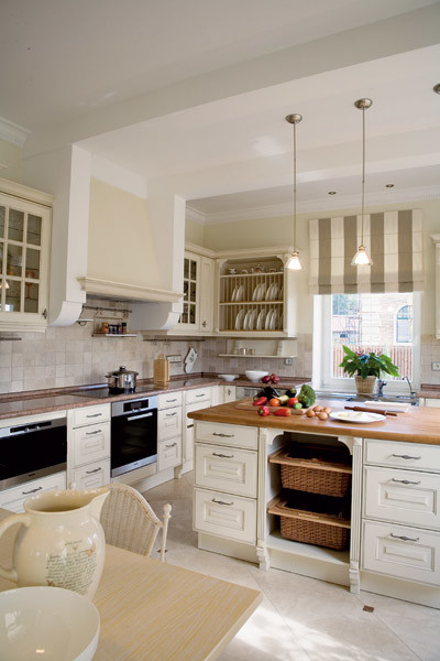 Photo 1.The light tulle curtains hanging in the bedroom were supposed to decorate the living room as well, since it is an elongated room, and heavier drapery on the windows would not have looked its best. The hostess suggested a radical solution - to hang flat roller blinds in the living room instead of tulle. Photo 2. The solid board on the floor in the living room is laid out according to a certain pattern. Such multidirectional laying, in the form of "carpets", zones the living room into a dining room, a fireplace and a sofa. The passage to the kitchen is maximally open on one side, but also isolated. It was separated from the dining room and the hall by two types of doors. Hinged doors are installed on the border with the first room, and on the second - sliding. Photo 3, 4. Kitchen. The kitchen design is determined by the classic facade of the house. Hence the aged vanilla-colored panels. The most difficult thing was to fit the stainless steel Miele (Germany) appliances into the Rot Punkt (Germany) furniture set in country style. But Elena Welchli coped with the task perfectly. Even the sockets and ABB (Germany) switches received vanilla-colored covers with silver edging. A plasterboard structure imitating beams was built above the stove and the island part of the kitchen. At first, they planned to hang copper utensils on it. But the owner thought this solution was too heavy. She suggested installing modern lamps. The kitchen apron is laid out with natural aged travertine, and polished stone with red marble inserts was used on the floor. The color of the stripes on the Roman blinds matches the patina that decorates the panels of the set.
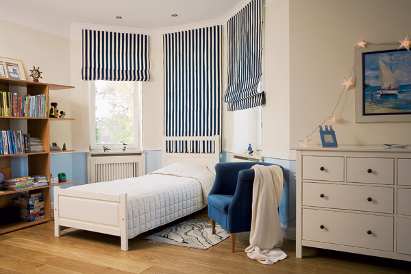
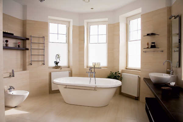
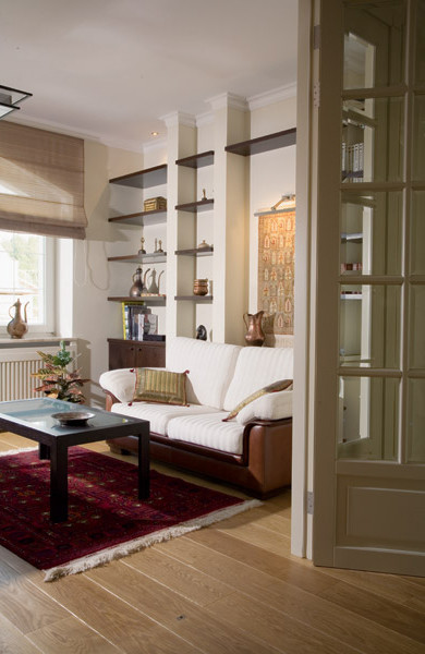 Photo 1. Children's room.The children's room of one of the boys is made in a "marine" style. It is furnished with inexpensive laconic furniture from Ikea (Sweden). The simple linear design of the chest of drawers dictated the decision for the border, visually dividing the walls into two components: a blue bottom and a light beige top. This border was made of a straight wooden frame. Photo 2. Bathroom. The bathroom seems to be carved from a single stone. This illusion was created by finishing the walls with seamless porcelain stoneware (30x60 cm) from the Dual collection by Revigres (Portugal). The countertop under the sink is made of monolithic concrete and faced with tiles in the color of wenge veneer, which covers the furniture. It was decided not to install glass shelves on brackets. They were built into the wall using tile adhesive, after cutting holes in the tiles. Photo 3. Study. The owner's study resembles the headquarters of a colonial company. Dark furniture, oriental carpets on the floor and walls, copper teapots. It was the leather sofa with vanilla-colored pillows that became the starting point for developing the interior of the room, it moved from a city apartment, and oriental household items migrated from Kazakhstan, where the family lived for a long time. Textured Roman blinds are combined with solid wood boards laid on the floor. Cabinet furniture Bamax (Italy). Operation of the 1st floor
 Operation of the 2-nd floor
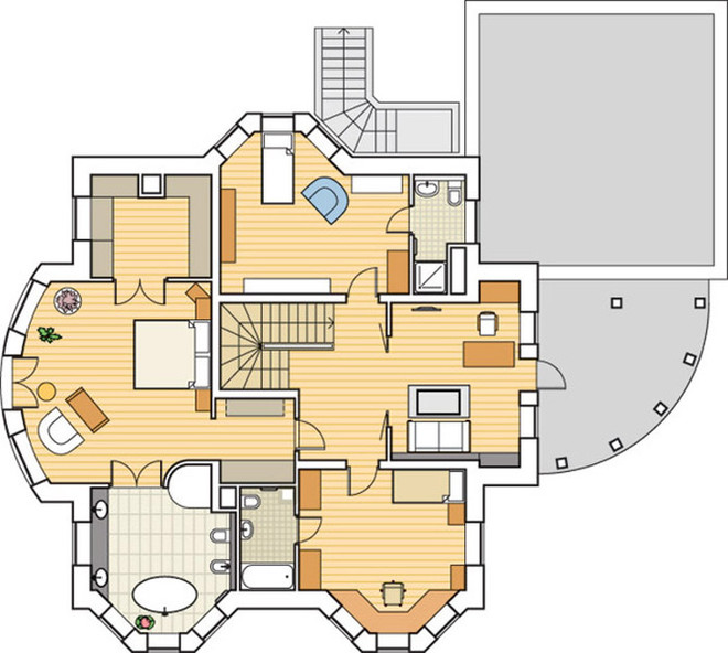 The total area of the house with technical rooms is 350 m2.
