Text by Irina KupriyanovaPhoto by Sergey Morgunov Stylist Elena Belova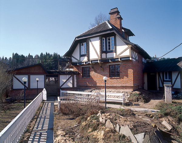 Private house planning
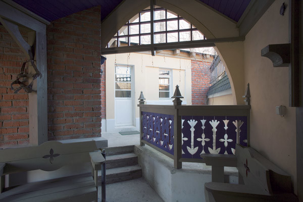

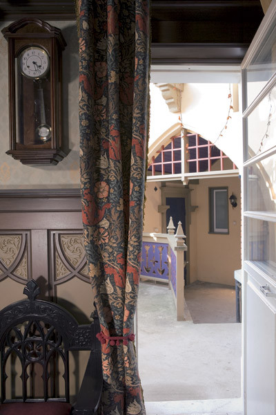 Photo 1.A well-thought-out layout of a small plot, well-executed extensions, interestingly designed courtyards decorated with original details - all this creates the impression of a large medieval farm on an area of only eight hundred square meters. Photo 2, 3. Architectural elements borrowed from different styles peacefully coexist with each other and give the house individuality and unique charm. For example, a fragment of the cornice, fixed above the center of the pointed arch, imitates the castle element of the masonry. The Gothic spire and the decorative trefoil-shaped opening that adorn the partition between the fence and the house are perceived as an architect's prank. Photo 4. The office. How nice it is to take a break from work and go out into the fresh air of your favorite courtyard. At first it was a dream. Then, Vladimir, an even older schoolboy, acquired some skills in drawing. They have survived to this day. And, looking at them, one can say that everything has come to life practically unchanged. "My father's stories about Germany, which he often visited, and the fairy tales of the Brothers Grimm greatly impressed me," says Vladimir. And so he wanted to make something similar to a German courtyard. Most likely, it was these thoughts that led him to the architectural institute after the army. The knowledge he acquired there, in turn, helped to enrich and decorate the house with beautiful details. Planning solution
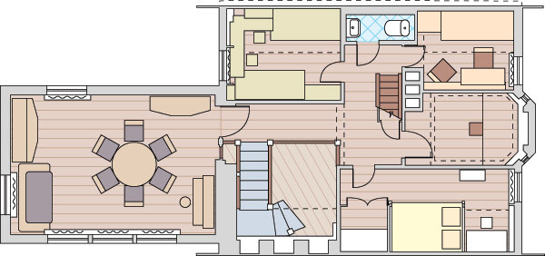
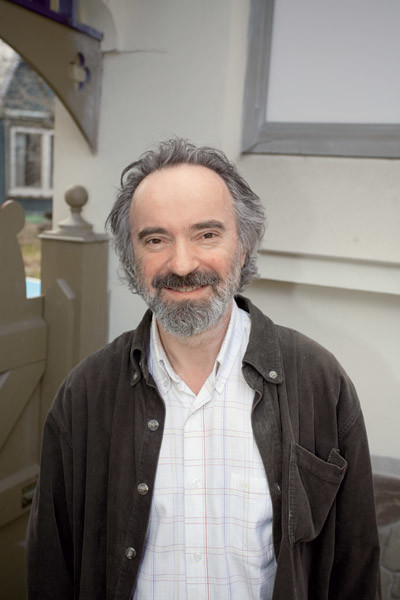 The layout of the house evolved and changed as time went on.the emergence of more and more extensions. At first, the building measured 6.5 x 6 m inside and 7.5 x 7 m outside. The ceiling height on the first floor was 2.3 m. The small volume entailed smaller dimensions of the doors (height 1.8 m, width 55 cm). The furniture was built in on site, with precise consideration of ergonomics. To do this, the owners experimentally tried on pieces of furniture, paying attention primarily to their convenience. At the same time, they tried to ensure that the details matched the scale of the room as a whole. If you violate the spatial harmony, irritation and a feeling of discomfort will subconsciously arise. Despite the fact that the ceilings in the dining area are low, they do not press. This was achieved by organizing a double-height space. The free space of two floors near the staircase is clearly visible from the living room. As a result, the adjoining dining room does not seem cramped. The architect considers the resulting "warm" floor in the bathroom on the first floor to be a technical success. A boiler room was installed under this room. When the AOGV is on, the hot air heats the tiles on the bathroom floor. The other rooms were calculated no less carefully. Construction began back in the days of the Soviet Union, when the choice of building and finishing materials was small. In addition, the young architect did not have significant funds. Therefore, in order to create an interesting non-standard world with Gothic elements, he decided to use non-standard techniques. The interior of the first floor turned out to be especially intricate and beautiful. "Do you think everything here is carved out of wood? No, it's a trick! laughs the owner. It turns out that the so-called carving is made of glued ten-millimeter MDF sheets and covered with either Tikkurila paint or water-based varnish from the same manufacturer. First, the architect developed sketches of the parts, then made their life-size patterns from thick Whatman paper, after which the talented cabinetmaker Valery Shevlyagin cut them out of MDF with a hand router, trimming the corners. By gluing one element to another and tinting them with varnish, the craftsman created the effect of carved mahogany. Thanks to the invented technology, a linear meter of such carving turned out to be cheaper per linear meter than ordinary built-in wardrobes. Let us add that all the work was carried out in the architect’s own workshop, organized in one of the extensions to the house. The remaining interior elements (the fireplace, furniture on the first floor, decorative details of the stairs) were created in the same workshop from simple materials. In general, the house, Vladimir believes, turned out to be a kind of demonstration of ideas. It was very convenient to work. No one had to be persuaded. He was both the customer and the architect. And although new interesting details are still appearing in the interior, and the house is gradually expanding due to the extensions, the architect believes that his plan has been mostly realized. Now a large happy family lives here: Vladimir with his wife Natalia and their five wonderful children (aged from 5 to 21 years). Architect Vladimir MoskovkinMaster cabinetmaker Valery ShevlyaginStained glass by Anastasia Korovina
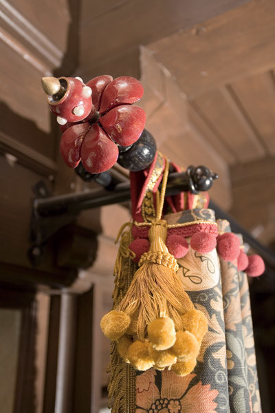

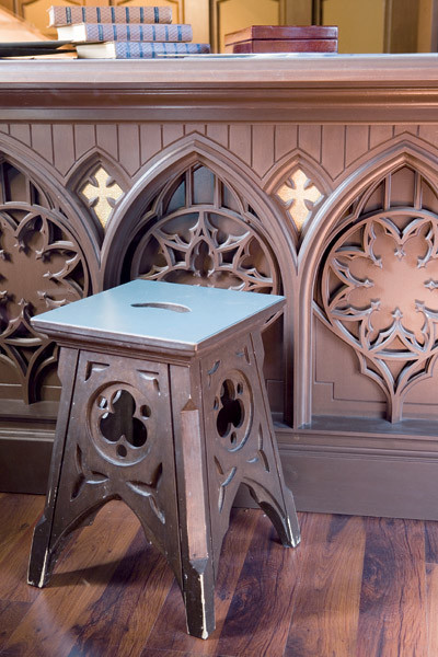
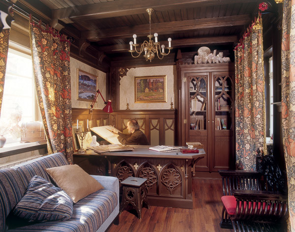 Photo 1.The architect's wife Natalia was engaged in the design and sewing of the curtains. Photo 2, 3. The entrance to the office is crowned with a beautiful carved portal made of MDF. The golden background, on which the decorative elements stand out in contrast, is not made of real gold, but of ordinary vinyl wallpaper covered with paint. All the furniture - a chair, a wardrobe, a desk - is also made of MDF. And the table top is faced with wear- and heat-resistant Dutch linoleum imitating genuine leather. It also turned out to be appropriate in the dining room. Photo 4. The chandelier was bought for little money in an antique store and restored by the owner at home. It turned out to be not just one of the beautiful interior details, but a completely self-sufficient artistic object.
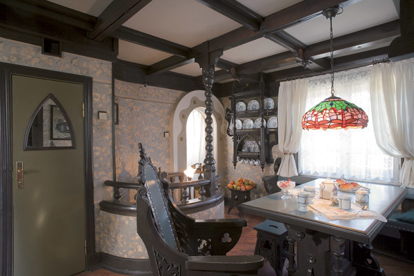
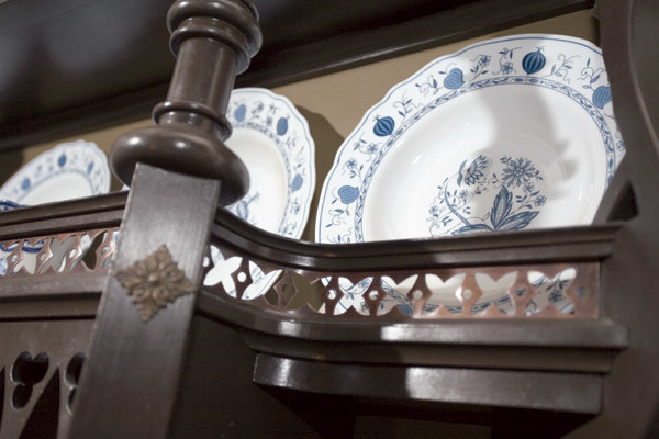
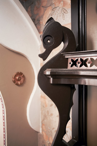
 Photo 1. Kitchen.In order to save space, the staircase leading down to the utility rooms was made spiral, with a small diameter of only 1.1 m. At the same time, it turned out to be very convenient for both adults and children. Photo 2, 3. The "fairytale" passage to the kitchen is decorated with a decorative form made of plasterboard, made in the form of a wave. Seahorses on the shelves seem to swim out of the foamy depths. Polyurethane flowers and trefoils on the ceiling beams are covered with real gold leaf. Photo 4. The architect even found a use for old worn-out ten-kopeck coins, making them part of the decorative overlays on the stairs.
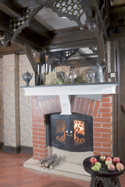
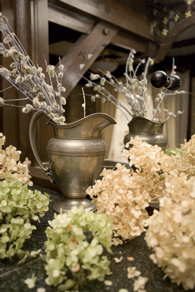

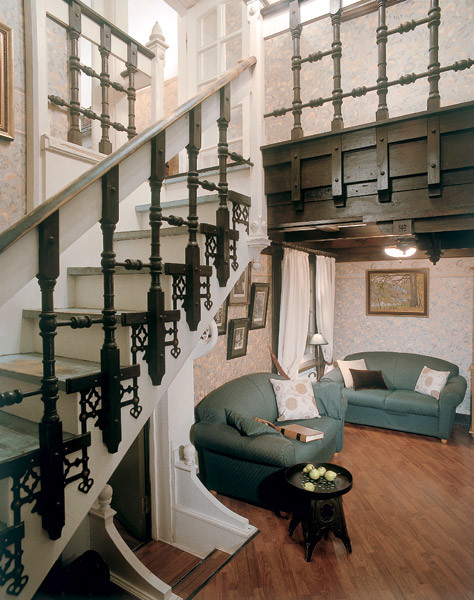 Photos 1-3.The chimney pipe with a built-in damper is hidden behind the mirror above the fireplace. The mysterious ball on the mirror surface is its handle. The chimney pipe runs horizontally under the ceiling of the bathroom and in the kitchen area it penetrates (along with the natural ventilation ducts and the boiler room chimney) the ceilings and the roof. The firebox doors are made of ordinary iron sheets and covered with black heat-resistant paint. The architect personally cut out the pattern on the surface with a jigsaw. Photo 4. Fireplace. Vladimir used the space under the stairs to create a soft corner. Two small sofas opposite the fireplace form a cozy place to relax.
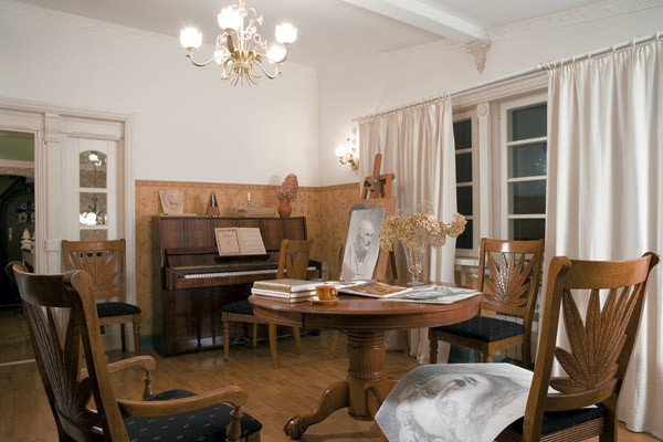
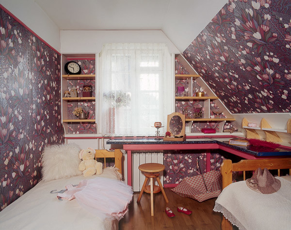
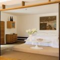
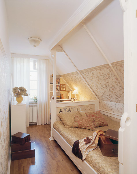 Photo 1. Children's living room and study room.At first they wanted to make a living room out of this room. But since it is on the second floor, they rarely gathered here. But the children began to use it for their own affairs as the most spacious and bright. And the room turned out to be a real "study" for music and drawing. Photo 2. Girls' room. One of the rooms on the second floor is a bedroom for girls. The plant theme of the drawing on the vinyl wallpaper creates a romantic mood. You come in here and it's like you're in a blooming garden. Since the girls are of different ages, their interests and hobbies are different. The caring father of each made his own system of shelves for favorite and necessary things. And on the large corner wooden tabletop there is enough space for everyone. And everyone can do their favorite thing. Photo 3. Bedroom. In all the rooms on the second floor, Vladimir made the most of the attic space. With the help of a simple design of decorative wooden posts and a cornice on the ceiling, he created a kind of cozy alcove for the bed.
The whole object
- Ceilings: plasterboard
- Walls: wallpaper
- Floor: laminate
- Finishing and some furniture: MDF
InformationThe foundation of the house is strip, monolithic.And since the soil on the site is sandy and water drains easily, it was laid to a depth of only 1 m (that is, they did not play it safe and take into account the standard depth of soil freezing in the Moscow region - 1.4 m). The walls were built of brick. Their thickness in the semi-basement is 38 cm, and on the first and second floors - 25 cm. From the inside, the walls are insulated and covered with plasterboard. Interfloor ceilings are wooden beams covered with boards. The attic is a frame structure made of timber. The half-timbered house was made of sheet material - chipboard. They were recently replaced with cement bonded particle boards (these boards do not deform under the influence of humidity changes and have a smooth surface that is easy to paint). Due to the extensions to the house, the roofs had to be made combined. Unfortunately, their connection is the weakest link of the building. Operation of the first floor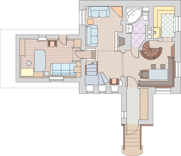 Operation of the second floor