The apartment in question is located inmonolithic brick house, leaving minimal possibilities for moving walls. The customer defined his wishes approximately as follows: to transform an apartment with a standard layout into a home with its own unique character, and for each room to combine functionality, individuality and comfort, without extravagance. He practically did not limit the designer's freedom. According to the authors of the project, one of the traditional methods was most suitable for solving the task: to organize the space with the help of simple and pure geometric shapes. Pure form is attractive because it has absolute expressiveness and does not become boring over time. Therefore, the floor, walls and ceiling in this case are solved only with planes. The only exception is that the corner of the dressing room was rounded. This was done in order to increase the space of the corridor and ease of movement. The owners of the apartment wanted to see smooth textures and light tones of a natural color scheme in the interior, without a pattern. Only for the kitchen they asked to make an exception - it had to be bright and "appetizing". At first the owner intended to order green kitchen furniture. But then the plans changed, and bright orange furniture was purchased, which created that very "appetizing". When using seemingly simple solutions, it is difficult to avoid pitfalls. The quality of construction and finishing works is of primary importance here. Even the slightest flaw can negate the advantages of the project, and then the desired result will become unattainable. Fortunately, in this case this did not happen, and the owners got exactly what they wanted.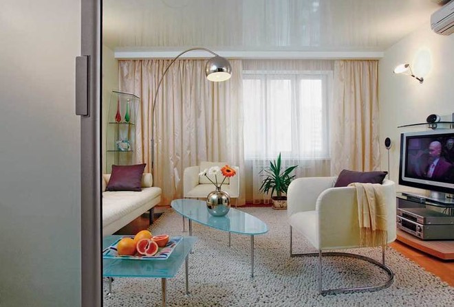 Remodeling of an apartment in a panel house
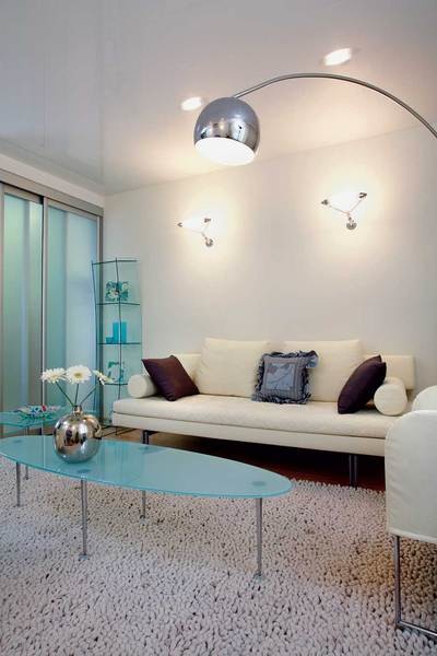

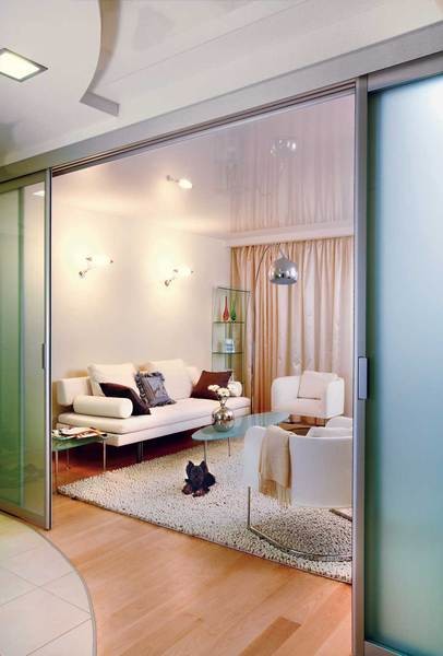
- Photo 1 When choosing upholstered furniture for the living roomThe low ceilings and small area of the room were taken into account. Compact armchairs and a sofa on light, one might say, "airy" supports allowed to achieve proportionality of the furniture and the room.
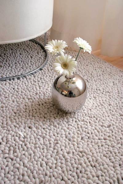
- Photo 2, 3 Usually the living room is dominated by softfurniture. But in this room, the carpet is the main focus. Thanks to its original surface, the texture of which resembles sea pebbles, it looks extremely impressive. The carpet is also good because it is made exclusively from natural materials, which is not so common in the age of synthetics. And although its design was developed 30 years ago in one of the oldest Belgian factories, the carpet fits perfectly into a modern living space.
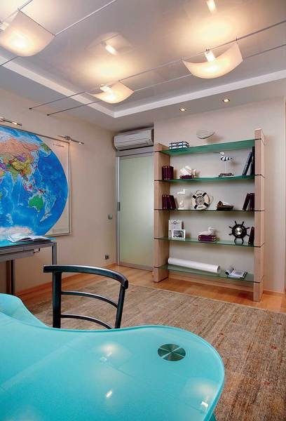
- Photo 4 The owner loves sea travel, and everything in the office reminds him of this: lamps in the form of sails filled with wind, the streamlined shape of the glass tabletop, resembling a wave.
- Photo 5 In the bathroom decided to install a shower, which immediately occupied almost the entire area. The sliding door, which does not require free space for opening, saved the situation.
Planning solution
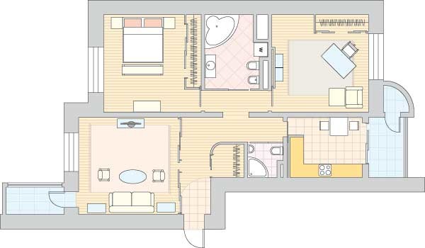
 It was clear to the authors of the project from the very first moment thatThere is no need to try to change the layout radically. We decided to limit ourselves to small, simple-to-implement (and easy to agree on, which is important) alterations. Traditional methods of optimizing living space were taken as a basis. For example, enlarging the bathroom at the expense of part of the corridor, installing a sliding door system (which makes it possible to combine two isolated rooms if necessary), as well as built-in wardrobes. All this made it possible to use the space of a small apartment with maximum efficiency. The house in which the apartment is located was built not so long ago, but the ceilings here are low - 2.7 m. In addition, due to the poor quality of the construction work, there was a significant difference in height. To level the surfaces and create the illusion of space, we settled on glossy stretch ceilings. Thanks to this material, the minimum is 3.5 cm. And at the same time, the electrics were removed behind the suspended canvases, thus providing hidden wiring.
In a collection of ideas
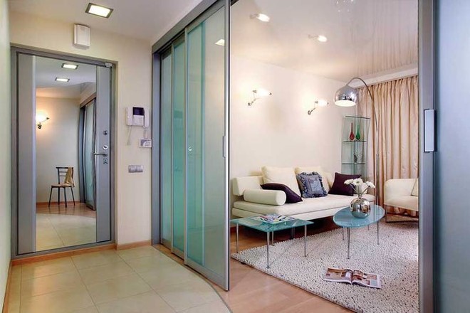
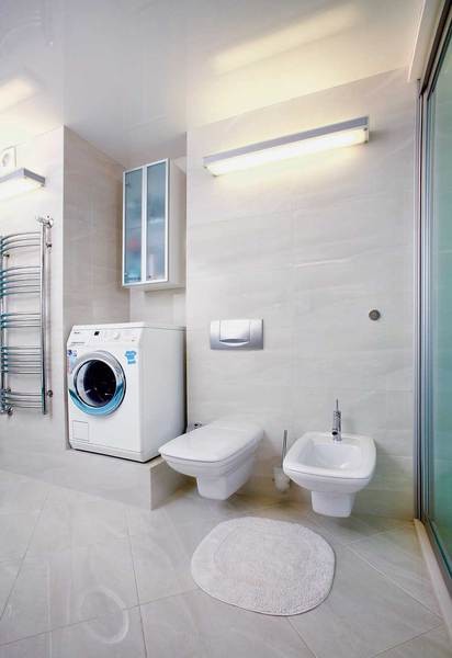
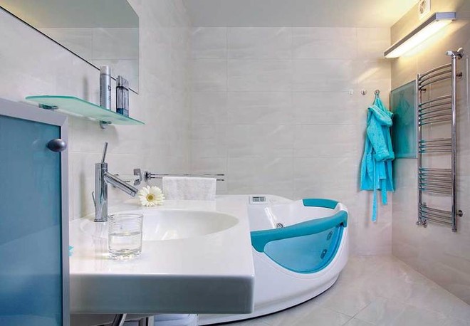 With the help of a sliding door system measuringThe architect successfully solved the task set before him - to provide the possibility of transforming the space. Translucent glass doors slide to the side, as a result of which the corridor and the living room become a single room. The mobile system has only six sections, three of which move away from the center to the walls. Maple parquet boards are laid on the floor in the living rooms. And in the kitchen, in the hallway area (with part of the corridor) and, of course, in the bathrooms, tiles were used for practical reasons. For these most "passable" rooms, such finishing material is especially good, because ceramic tiles are durable, wear-resistant and do not absorb water. A spacious cabinet for the necessary household items was hung in the niche above the washing machine. During the day, it is used only for its intended purpose, and at night it also provides emergency lighting thanks to the light bulb located inside and the frosted glass on the doors. When finishing bathrooms, everyone asks themselves: what is the best way to decorate plumbing equipment, but maintain convenient access to it? There are different options for solving the problem: a removable panel covered with tiles on magnets; a door painted in the color of the walls, etc. Here, the niche with communications was closed with frosted glass.
Interview with the hostess
«This apartment– is our firstour own home. We used to rent an apartment with a very simple interior. In our own home, we wanted to make everything modern, using the latest design developments. A light interior is my husband's wish. In my opinion, this is the best option for our small apartment. Furniture and carpets were also selected in light colors, so that there were no too many active contrasts. The fact that there are many glass surfaces does not bother us at all, it only simplifies cleaning. After all, my husband and I live together, and we do not have to worry about something breaking. The light upholstery of the furniture does not scare me either: the covers are easy to remove, the modern fabric (Alcantara) is easy to wash and iron. The designers - real masters of their craft - did everything the way we wanted. I like everything very much. Compared to other apartments with the same layout, ours seems much more spacious, although the reconstruction was very minimal.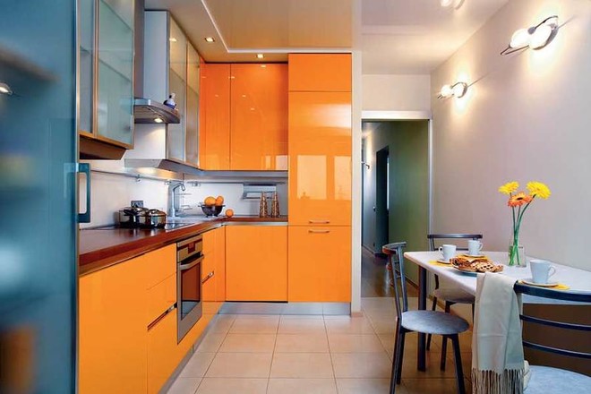
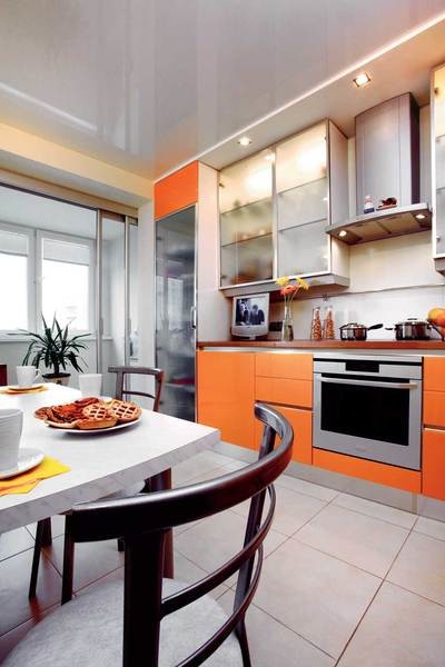
- Photo 1 The rich color of the furniture may fade over time.get bored. And since people usually spend quite a lot of time in the kitchen, the table was positioned so that the bright colors of the furniture fronts would not be too striking to those sitting at it.
- Photo 2 In the glossy surface of the ceiling, as if ina large mirror, reflects the kitchen furniture. The additional orange blotches that appeared due to this increase the impression of a bright accent in the interior.
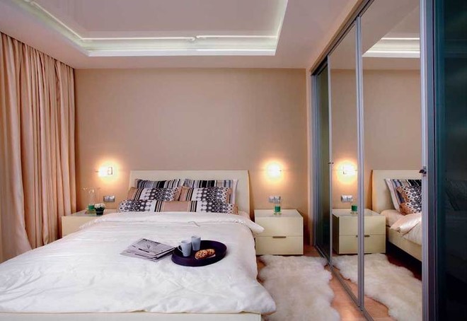
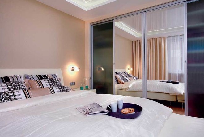
- Photo 3, 4 Despite the brevity of the situation andlack of extra details, the bedroom turned out to be the most comfortable room in the house. Unobtrusive lighting behind the suspended ceiling and an optimal combination of colors and textures of fabrics create a soft, intimate atmosphere.
Entire object
Floor:solid maple board, "TamPol", (Russia)Partitions, doors, built-in wardrobe facades: Rimadesio (Italy)Light: Metal Spot, ITF (Italy)Plumbing: Keramag (Germany)Plan before redevelopmentTotal area - 89.1 m2,Ceiling height - 2.70 m2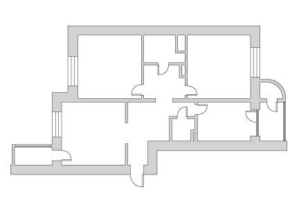 Plan after redevelopment Total area - 89.1 m2, Ceiling height - 2.60 m2