Photo: Dmitry Livshits.
Do no harm!
This penthouse's huge windows offer viewssuch views that simply take your breath away. All around is just sky and clouds. And below is all of Moscow as if in the palm of your hand. The case, one might say, is unique: most new buildings in the capital suffer from a lack of natural light, and architects have to go out of their way to solve this problem. Here, the glazing area is almost one hundred square meters! Therefore, the authors of the project had a completely different task - to come up with an interior that would become a worthy "frame" for the panorama of the city.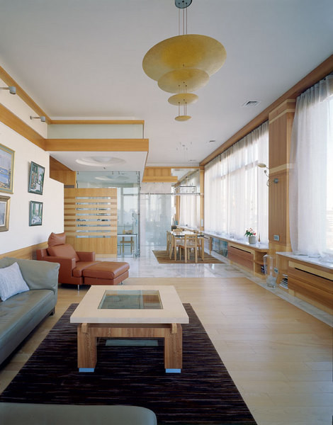 Panoramic glazing
Three in one
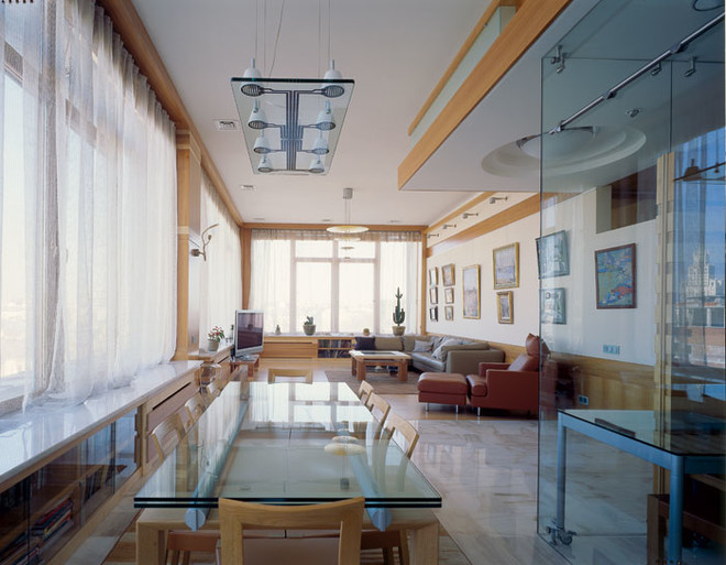
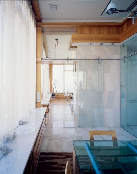
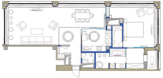
“The main difficulty was the abundance of windows andstructure of the room, — recalls Alexey Komov. — After all, you can’t hit the glass with a partition! ”The layout solution was suggested by the room itself: the supporting columns clearly divide it into three identical squares. The most logical thing in such a situation is to “string” the functional zones, like beads on a string. In fact, this is a good old enfilade, but rethought in a modern way. The role of the rod that “holds” the space is played here not by doorways, but by a series of windows with marble window sills that recede into perspective. The apartment is shot through from end to end. The feeling of integrity is enhanced by a wooden “ribbon” under the ceiling, encircling the interior along the entire perimeter.
Along and far
Uniformity multiplied by a hundred or moresquare meters of living space, easily turns into a bore. The architects solved this problem too. As an antithesis to the vast living room, they came up with a hallway - chamber, with a low ceiling, entirely paneled with wood. The contrast was striking. To soften it a little, the authors of the project made a kind of buffer - they deliberately lowered the ceiling above the kitchen, "covering" it with a plasterboard box (partially this structure extends into the living room area). As a result, immersion in the interior turns out to be very smooth: from small to large, from low to high, from dark to light. Having completed this path, you are already ready to perceive the general logic to which the space is subordinated.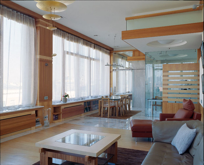

The head of everything
“The main thing here is light and air,” he says.Alexey Komov. — That’s why we tried not to overload the interior with details. You could say that this is an anti-bourgeois project.” The overall decorative solution for the interior looks like this: lots of wood and very little color. Three different types of wood were used in the decoration: dark sycamore with a thick honey shade, light sycamore*, and eucalyptus with a pronounced striped texture. Of course, the apartment also has marble and glass (in huge quantities). But they are good precisely because they are modest and do not pretend to be soloists. “Wood is a very expressive and self-sufficient material that can “play” depending on the lighting,” says Fyodor Rozhnev. — That’s why we decided to avoid bright color accents — they would simply “kill” the wooden surfaces.”
There are no seats!
Lots of windows are good.But this "medal" also has a downside - an acute shortage of walls along which to place furniture. In addition, the owners wanted to decorate the interior with paintings from their own collection, and the only large wall turned into an exhibition surface. They had to forget about cabinets and other bulky objects right away - the wardrobe and impressive storage systems in the kitchen allowed them to do without them. But what to do with the books? It was decided to settle them on the shelves arranged under the window. To prevent the proximity to heating devices from damaging the paper, the books are separated from the radiators by a thick wooden partition. By the way, the lack of walls is not the only problem that arises with panoramic glazing. It is very difficult to arrange a home theater in such an interior - an abundance of glass and high-quality sound are incompatible.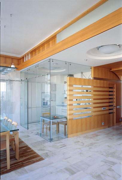
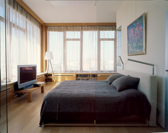 My sunThe main feature of this interior isthe ability to undergo endless metamorphoses. It changes as the sun moves across the sky. Protecting the house and its inhabitants from the scorching rays was not the least of the architects' concerns. Now the owners have a choice - to hide from the heat behind thin translucent curtains or lower wooden blinds. (With their help, the space can be transformed into an absolutely deaf, impenetrable box.) Add to this several lighting scenarios involving electricity, invented by the authors of the project, and you get an innumerable number of options. "During the day, the apartment seems to absorb the sun," says Andrey Pchelin. "And at night, it generously gives off light outside, turning into a shimmering aquarium." In the next article, you will learn how to make


