


 Minimalism in the interior
 How to increase the space
- Photo 1. Living room.The load-bearing walls are made of brick. In order to preserve the expressive texture of the surface, they were covered with an enveloping layer of plaster mixed with PVA glue for viscosity, and painted. Perhaps, it would be difficult to find a more spectacular finish on the modern market of decorative materials.
- Photo 2.In the room with a beautiful front view of the embankment of the Moscow River staged a living room. Accurately calculated and thoughtfully arranged vertical and horizontal forms and volumes allowed to achieve the necessary harmony in the interior. In addition, every detail is functional.
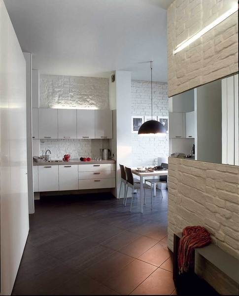
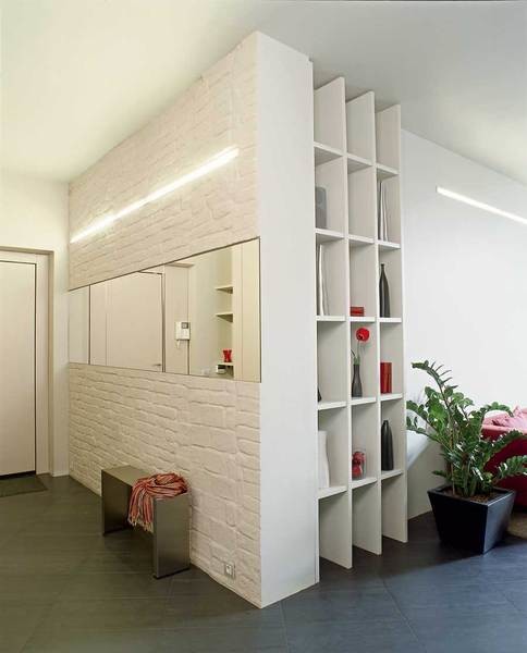
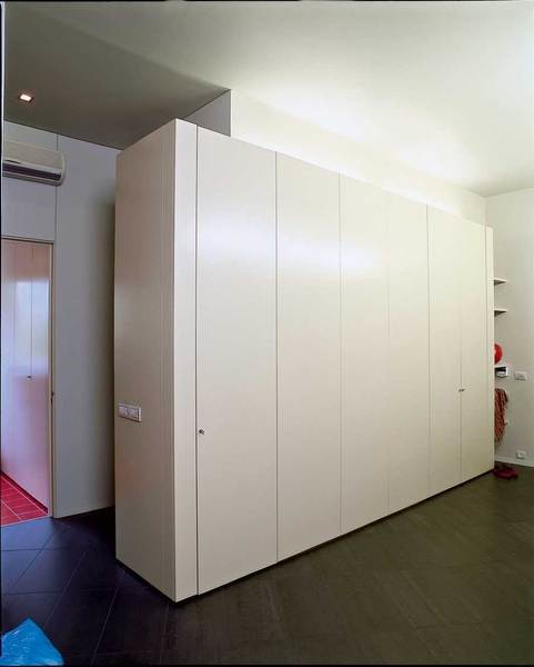
At first, the architect Mikhail Dautov, focusing onfuture combined space, made changes to the layout. Now the apartment has only two isolated rooms - a bedroom and a large bathroom. The next step was the widespread use of built-in structures. For example, all household appliances and other household items were hidden not in the utility room, but in deep cabinets built between the bedroom and the bathroom. At the same time, this "wall" separates the bedroom from the hallway. The cabinets are placed "in a jack-and-socket" pattern, that is, some of them open towards the bedroom, and some - into the hallway and entrance hall. The composition ends almost in the kitchen. Therefore, after thinking, a refrigerator was placed in the last cabinet. "Every centimeter of space counted," says Mikhail. The architect also used a number of design techniques designed to visually enlarge and simultaneously decorate the space. The texture of the load-bearing brick walls was preserved, an original lighting system was installed in the form of light strips located in the wall, not to mention the long mirrors that play an active role in the hallway and bathroom.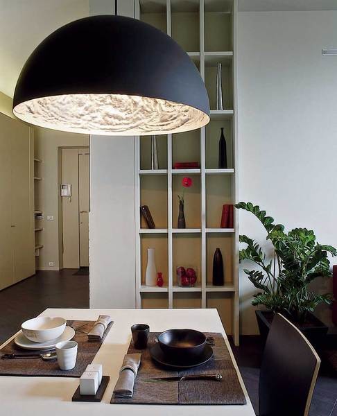
- Photo 1. In the room with a beautiful front view of the embankment of the Moscow River staged a living room. Accurately calculated and thoughtfully arranged vertical and horizontal forms and volumes allowed to achieve the necessary harmony in the interior. In addition, every detail is functional.
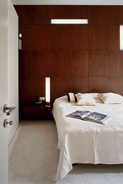
- Photo 2.The glowing stripes in the wall look incredibly impressive. This result was achieved in the following way. Daylight lamps were placed in specially hollowed out niches and covered flush with the wall with plastic covers. The soft light does not hurt the eyes, but it is quite enough for all rooms in the apartment.
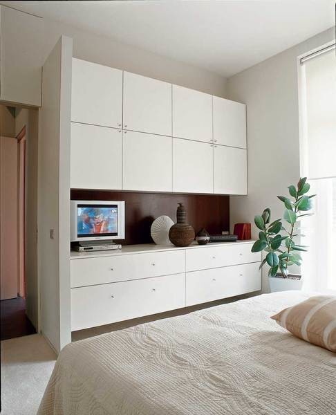
- Photo 3. The wall behind the headboard is covered with MDF panels finished with cherry veneer, which were made according to the architect’s sketches at a Moscow factory.
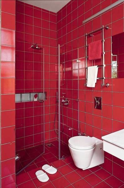
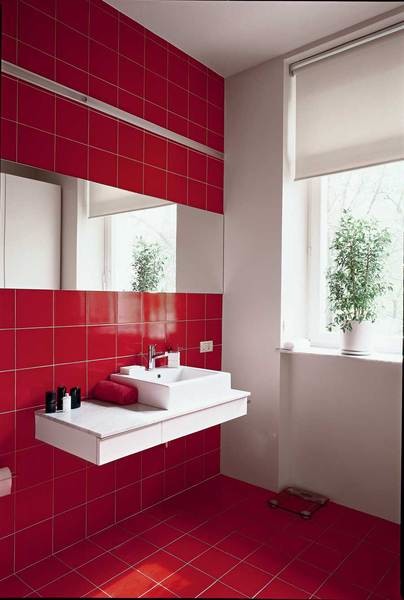
- Photo 4.The scarlet bathroom is the only bright room. In small apartments, the main rooms are rarely made active in color, since too saturated tones in a limited space are oppressive and eventually become boring. The bathroom is not a place where you are constantly, and the bright color of its walls does not have such a strong impact. In addition, a certain color shock is an additional aesthetic and emotional impulse that is very necessary in the morning to wake up and come to your senses.
- Photo 5. A bathroom with a window in a city apartment is a great rarity and luck. And in this case, the owner was doubly lucky, since it overlooks a quiet, cozy courtyard with linden trees.
According to Mikhail, when working on this interiorFirst of all, we thought about functionality: "There is nothing superfluous here, nothing done just for the sake of beauty." The resulting living space can be described as exquisitely monochromatic. True, the rather strict color scheme is diluted with bright splashes, in particular, the color of the fabric on the sofa. The architect believes that such inserts only emphasize the restrained color scheme of the interior as a whole. "And besides, there is always an opportunity for self-expression: if you don't like the lingonberry-colored sofas, you can change the upholstery or order covers. By the way, these sofas come with spare covers. Replacing them is much easier than, say, repainting the walls."
In a collection of ideas
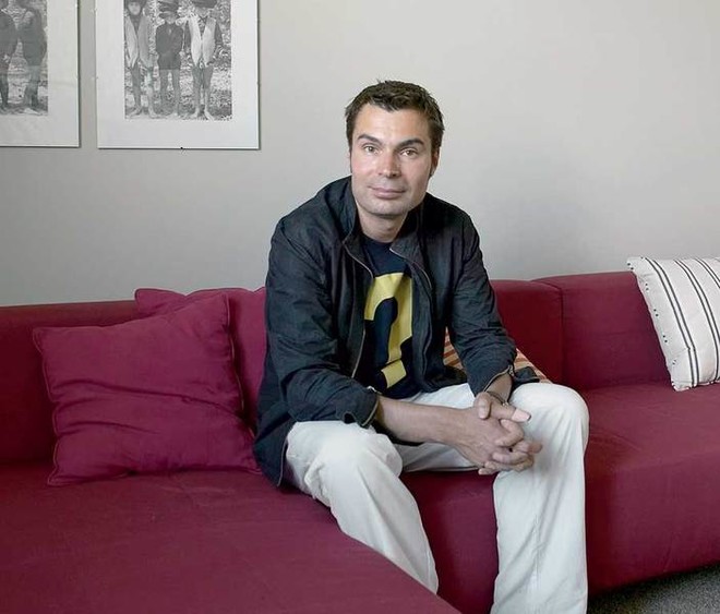
Interview with the owner
«Mikhail Dautov made an apartment for oneof my friends. And despite the fact that the interior was designed in a completely different style than I prefer, I liked this work right away. When we started thinking about how my apartment would look, I briefly outlined the task to the architect. He suggested a number of interesting solutions, and the work began. As a result, everything planned was implemented quickly and adequately. The apartment is small, and I wanted it to have as much space as possible and as few decorative elements as possible, which usually eat up this space. There are high ceilings here, and we tried to maintain the specified height. All technical details were put away in closets. Nothing superfluous, no overload of details, clear contours, simple geometric shapes. In a word, minimalism in its purest form - that's the result we were striving for. Many of my guests say that the apartment is too restrained, but I feel comfortable here. I doubt I could exist in another space. A clear, harmonious interior matches my character and idea of home.
Planning solution
 Initially, it was an apartment in a Stalin-era buildingThe 1930s apartment had a standard layout for that time: a small entrance hall, a narrow (less than two meters) long corridor leading to a bathroom, rooms on both sides of the corridor, and an isolated kitchen. When asked what changes were made to the configuration of the apartment, the architect smiles and replies: "We tore down everything except the load-bearing walls." A large bathroom was built in place of the kitchen, and a kitchen-niche in place of the bathroom. The corridor was expanded at the expense of the bedroom. The room with a beautiful view of the Moscow River embankment became a living room. Thanks to the small kitchen in the niche and the absence of partitions in the public area, it was possible to create an open and fairly free space for the living room and dining room. The architect says that when working on this apartment, he mainly sought to identify and emphasize all the possibilities, decorative and spatial, that had already been incorporated into the interior by Soviet builders.
The whole object
Floor:porcelain stoneware (Italy)Load-bearing walls, brick: plaster, paintPartition between bathroom and kitchen: brickCeiling: plasterboardLight: Delta Light (Belgium)Windows: "AB;Bavarian House" (Russia)Doors, shelves, wall panels made of MDF, finished with cherry veneer in the bedroom: according to an individual project (workshop of V. Krot, Russia)Plan before redevelopment: Total area - 63.0 sq. m,Ceiling height - 3.35 m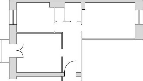 Plan after redevelopment: Total area - 63.0 sq. m, Ceiling height - 3.25 m
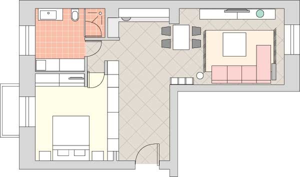 Text by Nikolay Bardenyuk Photo by Dmitry Livshits