Photo: Kirill Ovchinnikov. Times and Morals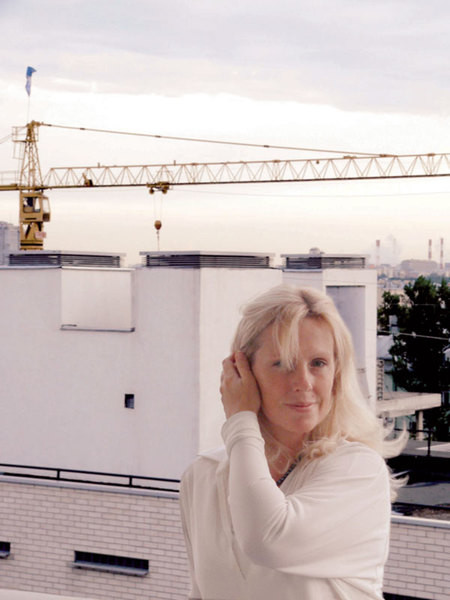 Italian style in the interiorAt one time OlgaFreiman lived in Rome for a long time. In her work, she is guided by classical architectural canons. It is not surprising that the bureau she founded in 1998 was named in the Italian manner - Il Centro Nuovo. Architect Olga Freiman remembers well those times when people's desire for luxury often crossed all boundaries of reason. It is not surprising that when one of the clients asked to decorate an apartment in a classical style, combining imperial Rome and the East, she became wary: "How not to overdo it?" The client reacted to this in his own way - he went to St. Petersburg, visited the Hermitage, visited Peterhof. And he drew his own conclusions: "It is impossible to overdo it!" Imperial sentiments are close to the Russian people. Especially now: life has become more stable, people feel like citizens of a great power again, - Olga reasons. - This is far from my client's first apartment: he managed to live in both a classic and a minimalist environment, and now he wanted to return to a traditional interior. But this is no longer the case when they tell you from the doorway: "I want columns because I like them!" The attitude to the classics has changed: people are actively interested in history, they understand "what's what". Evidence? Please: the fact that a person began arranging his home with a visit to museums already says a lot. But this is not all. Material values The owner of this apartment knows how to count money and considers the interior as a profitable investment. This, perhaps, is the novelty of the approach. "We tried to fill the apartment with objects that increase its capitalization, and therefore avoided obvious new construction covered with finger-thick varnish," says Olga.
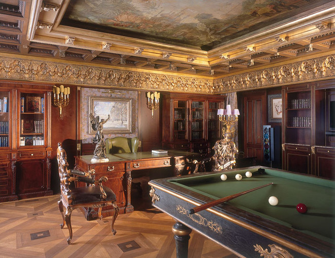
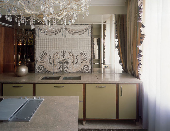
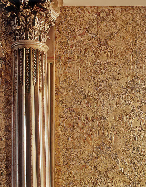
“Now you hardly meet people whoThey think that antiques have "bad energy". This is absurd: what kind of energy can an armchair or a couch have?! But the fact that these things are growing and will grow in price is an indisputable fact." The furniture was made to order by European companies that specialize in replicas of historical furniture, strictly following old technologies. Now these workshops are going through hard times: "It is difficult for them to compete with the Chinese who have flooded the market," says the architect. "Asians cannot provide the same level of quality, but they have dumping prices, and this captivates. And not only amateurs: an Italian furniture maker I know recently bought Chinese sofas for himself - their retail price is almost three times lower than the cost price of similar items in Europe! And yet, people who invest in expensive authentic furniture are absolutely right: "Two of our suppliers (Francesco Elli and Stephane Davoy) could not withstand the Chinese expansion and recently closed their businesses. This is to the customer's advantage: his furniture immediately became a rarity." Another profitable investment is wallpaper from Zuber. It is hand-printed using 18th-century boards. These matrices have never been restored (otherwise the historical authenticity would be lost), they have chips and potholes, so the pattern is uneven, there are even unprinted areas. This is what gives such wallpaper its value.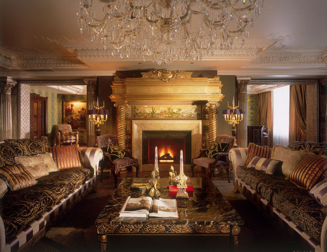
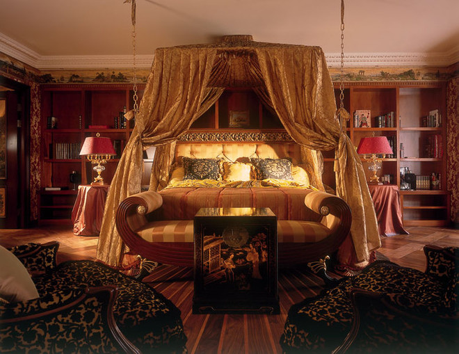
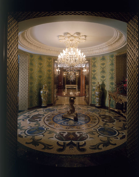
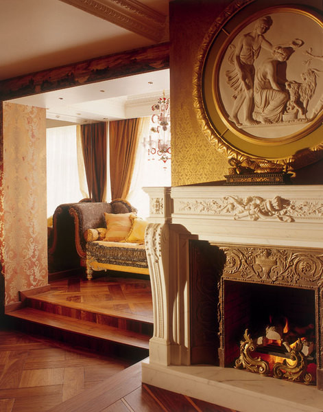
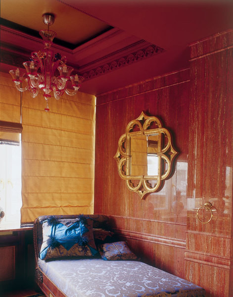
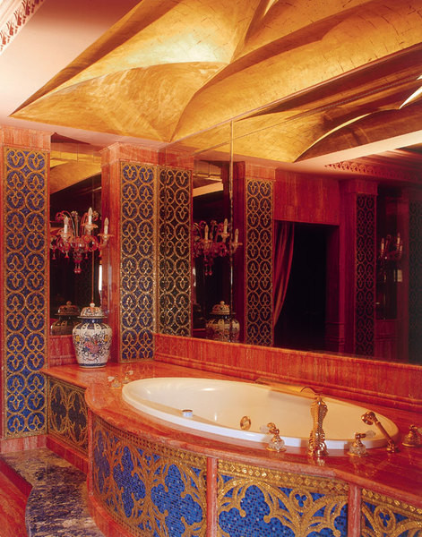
East—west«Romans are activeborrowed elements of culture from the peoples they conquered. In a sense, they were the inventors of the colonial style. So the customer's desire to introduce an oriental theme into the interior is, in principle, historically justified. The whole question is how exactly this is done». In this case, it is quite delicate. Bright, but few details are reminiscent of the East: a table in the form of a dragon in the hall, a painted lampshade in the study, and the finishing of the door portals in the living room. Noble metal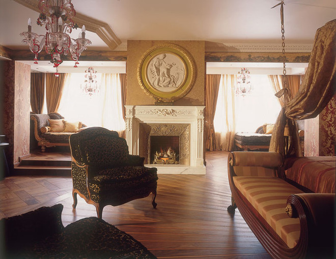 Drawing of inlaid parquet from Ebony & Co notis repeated in all the rooms. The picturesque frieze under the ceiling was made by Alexander Volkov. We wanted to take the apartment away from Moscow, to create the feeling that the southern countries are just a stone's throw away. That's why there is so much gold here: in many cultures this metal symbolizes the sun, and in our country it plays the same role, Olga explains. Gold should never "scream". Restoration artists Alexander Volkov and Valery Bliznyuk were entrusted with bringing it to the required condition. "We didn't want our gilding to look like samovar gold," Olga says. "And we changed the technology depending on what shade needed to be achieved in each specific case." As a result, the metal acquired a truly noble appearance: the shine disappeared, leaving only a warm and restrained shimmer. In addition to gold, the southern atmosphere in the house is created by mirrors. Instead of the usual amalgam, bronze is used in them. When you look at yourself in such a mirror, it seems that your skin is slightly touched by a tan.
Keep your head up!The client contacted Il Centro Nuovo after the walls had already gone up in the apartment and did not want to start construction from scratch. So Olga and her colleagues did not face the problem of a complete redevelopment: "We only slightly tweaked the obvious flaws to make the house more comfortable." The architect warns those who start arranging their home with a bare concrete box: "Theoretically, in a 500-square-meter apartment, the living room can be made as large as you like. But if you want to decorate an apartment in a classic style, you should not go too far. The ceilings in such an interior should be at least five meters high, but in modern houses they are much lower. And the larger the room, the more noticeable the disproportion." In this apartment, the original size of the rooms was acceptable, but this did not completely solve the ceiling problem - they had to be "raised" visually. "Customers are often scared when we suggest making complex multi-tiered stucco decor," says Olga. "They think that the rooms will seem even lower, but in fact this is a well-known technique: tiers combined with well-thought-out lighting create the illusion of perspective."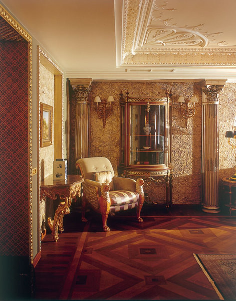
With the note "urgent" "We are orderingcarpentry and stucco work in Europe. Theoretically, you can order them in Russia, but then you have to control the process from start to finish, otherwise it will be like Disneyland. Our craftsmen cover the wooden panels with such a layer of varnish that they look like plastic." Many people simply do not believe that we made this interior in just a year," says Olga. Considering that the area of the apartment is 500 meters, that almost every surface here is carefully aged, and the furniture is made to order, the deadlines really seem fantastic. "We suggested that the customer determine all the details "on the shore", and then strictly adhere to the adopted plan. After all, if you endlessly adjust the project, the process becomes uncontrollable: money is wasted, deadlines are missed and "most importantly" the feeling of integrity is lost. Fortunately, the customer showed restraint. Deepest gratitude to him for this.
