Photo: Kirill Ovchinnikov. Design of a two-bedroom apartment
Rules of the game
“When I start a new project, the last thing I think about iscolor of the walls,” admits Anna Erman. “It is much more important to develop a convenient layout, make high-quality communications and lay a good floor. This is the basis on which you can then string any decorative solutions.” This time, the formation of the basis was delayed. “My client is a meticulous person, he delved into all the details, but he was constantly distracted by something. At first, he was actively studying: he was finishing law school, writing and defending his thesis. Then he spent two months training in the army. So the work moved slowly,” says Anna. Oddly enough, the endless delays only benefited the apartment. At first, the owner dreamed of a strict and restrained interior, and black ceilings could only be a nightmare for him. But water wears away a stone. “When it came to finishing, we had already known each other for a year and a half. During this time, the client realized that he could trust me, and was ready for unexpected ideas.”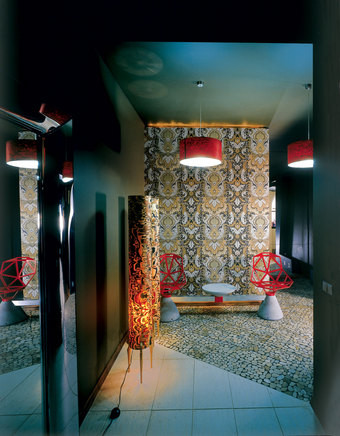 Entrance hall. The outer wall of the guest toilet is covered with Stro-heim & Roman wallpaper. By the wall is the Chair One bench, designed by Konstantin Grcic for Magis.
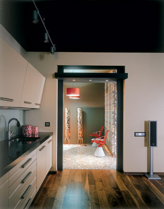 The kitchen-living room floor is covered with walnut parquet. Kitchen furniture by Del Tongo. Floor lamp shades are made of natural veneer.
Entrance hall
It is believed that the best way to visualizeenlarge a small room - paint it white. But Anna used a more radical technique: black does not push the walls apart - it erases them. The only point of support in the "boundless" hallway is the wallpapered wall. It is illuminated from above and below, so there is a feeling that there is a huge, light-flooded space right behind it. In fact, a guest toilet is hidden behind the wall (the customer did not want to waste precious meters on an additional bathroom, but Anna convinced him that in an apartment divided into private and public areas, it simply could not be done otherwise). The unusual floor finish was dictated by harsh necessity: the owner actually wanted to lay porcelain tiles here, but neat 30 x 30 cm slabs would have emphasized the incredible curvature of the walls. "To level them out, we would have to narrow the hallway by as much as twenty centimeters! "That's why we complemented the porcelain stoneware with polished pebble slabs (riverstone), which hides the unevenness," the designer explains. "Men only want one thing - a plasma screen on the wall. It's impossible to convince them otherwise. You have to distract attention from the screen with decorative means."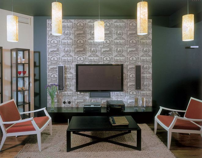 The walls are painted with matt Oikos paint. Wallpaper by Stro-heim & Roman. On either side of the coffee table are armchairs by Porada. Under the plasma screen is a cabinet by Molteni.
Living room
"Plasma panels disfigure the interior like nothing else"- says Anna. And since the client could not imagine a living room without a home theater, she had to work hard to find a compromise between technology and aesthetics. She placed the plasma and the speakers symmetrically located around it against the background of wallpaper with a complex active pattern - thanks to this, the equipment is perceived as a work of abstract art. To make this installation look even more impressive, the wall and even the ceiling were painted black. "Many people think that a dark ceiling looks lower than a standard white one. But they are wrong: it is not the color that is dangerous, but the sharp contrast between the ceiling and the walls. But if you paint them with the same paint, the border between them will be erased, and the room will seem incredibly high." Judging by the photo, the interior turned out dark, but this is not so. "Firstly, there is a lot of natural light here," the designer explains. — Secondly, there are a lot of lamps: five lamps with lampshades in the center, another one in the breakfast nook, plus spotlights in the kitchen area (just in case, I also provided sockets for floor lamps). And then, take my word for it: people pay attention to the ceiling last. As for the walls, only one of them is painted black. The rest are beige, as requested by the client." "A tall cabinet into which you can build in household appliances is indispensable in a kitchen-living room. It helps to make the cooking area very compact."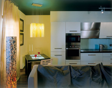 The breakfast corner is equipped in a niche (it was provided by the original layout). The "apron" of the kitchen is made of frosted glass.
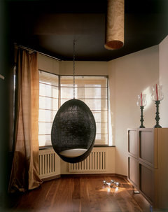 The owner asked to separate this corner of the living room to admire the view from the window. Armchair, Pierantonio Bonacina.
Furniture
Anna insists that the abundance of black surfacesin the house should not be misleading: “We did not stray far from the original wishes of the customer. Just repaint the walls and ceiling white or beige, and you will get the most ordinary modern interior, in which there is nothing radical. Look, for example, at the furniture - it is very high quality here, but absolutely neutral.” The house contains representatives of the best Italian brands (armchairs from Porada, a bed from Emme Mobili, a cabinet for equipment from Molteni), but among them there is not a single recognizable item. “I did not want to create an interior that would become outdated in six months,” the designer explains his choice. “And in this case, you need to avoid familiar, replicated objects. An exception can only be made for items that have already become design classics. Such as, for example, the hanging chair from Pierantonio Bonacina. These are eternal values!”
Bedroom
“The owner of the apartment is a young man, butvery thorough. He doesn't like hasty decisions. It took him several weeks to choose a microwave oven alone, and finding a suitable painting for the bedroom could take a long time. So that the wall at the head of the bed wouldn't be empty, I came up with an asymmetrical design with lighting and shelves on which to store books."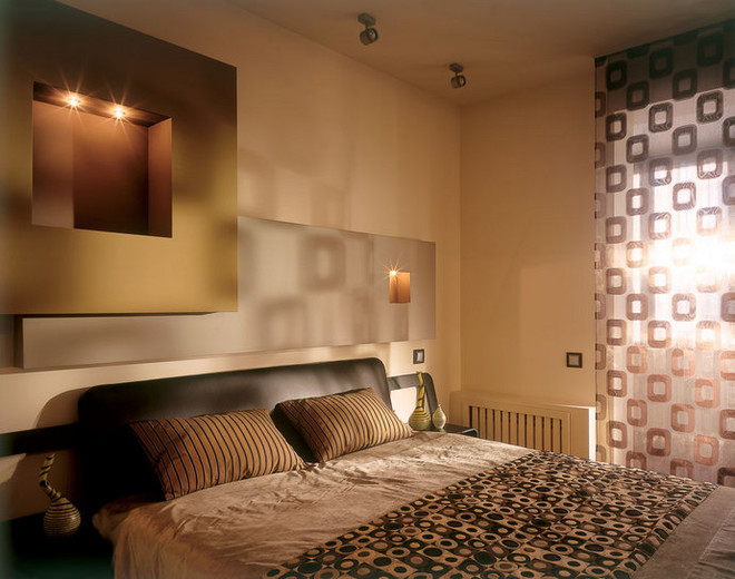 The bed by Emme Mobili is covered with a bedspread made offabrics with optical patterns from Cravet. Curtains are made from fabric from Chivasso. "First, we bought fabric for the bedspread and curtains, and then matched the paint for the walls to it. This allowed us to tone down the overly active pattern." Anna Erman recommends: 5 components of a good interior - Good layout. I mean not only the location of the walls, but also the arrangement of furniture. It needs to be thought out before the renovation begins. Without this, it is impossible to find the optimal location of sockets and make a conclusion for the overhead light. - High-quality wooden frames. There is no more miserable sight than white plastic double-glazed windows. – In a kitchen combined with a living room, there should be no tiled "apron" and tiles on the floor. – Large bathroom. A tiny bathroom, crammed with plumbing, is a real horror. I don't understand people who make a huge living room, but only allocate five meters for the bathroom. "The guest toilet is the face of the apartment. You can't skimp on its design.
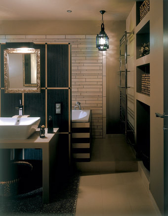 One of the walls, the sarcophagus of the bathtub and the partition are lined with tiles from Viva Ceramica. Anna does not like this finishing material, but the customer was implacable.
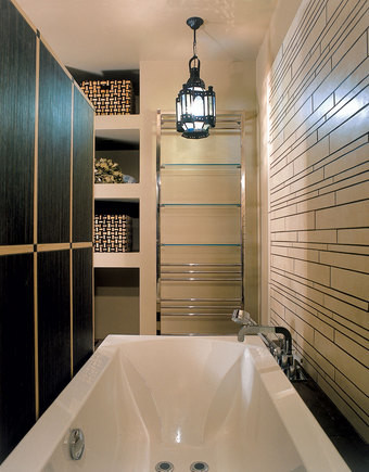 In the niche (it was in the apartment initially) they arrangedshelves for bathroom accessories. The sink and bathtub are equipped with Axor mixers. Commentary on the plan “We worked long and hard on the layout: the customer wanted at all costs to turn a two-room apartment into a full-fledged three-room apartment,” says Anna. “Eight different options were thought up and rejected, and in the end we realized that we would have to forget about this idea - there are too few windows in the apartment. Then we took the BTI plan as a basis and divided the space into two zones: public (hallway, kitchen-living room, guest toilet) and private (bedroom, dressing room, master bathroom and small study).”
 Next you will find out,


