Photo by Viktor Chernyshev, Victor Loginova. Project by Valery Zakerichnaya, Olga Proskurina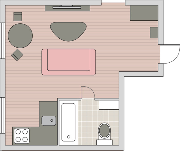 Color combination in interior photoNew ownersThe apartments set several tasks for the decorators. Thus, they wanted the renovated home to match their age and pastime as much as possible. The spouses work a lot, so they even prefer to have lunch and dinner in the city. The house should become a private territory that allows for a full rest. However, in order to be able to have a cup of coffee with several close friends, a small dining area is still needed. The decorators proposed the following concept of the space. The recreation area is formed by a soft sofa, an ottoman, a coffee table and a pair of console shelves under a plasma TV. The dining area includes a table with two chairs and a kitchen with a small number of household appliances - a refrigerator and a stove. The only deviation from the canons of minimalism is the a niche-showcase in the center of the kitchen-living room. However, its appearance is also justified: it is a ventilation box that has undergone minor changes.


- Photo 1. Living room before.
- Photo 2. Living room after.The materials chosen for the design were not particularly expensive. The cost of the furniture was not too high. But the owners decided not to skimp on accessories. Thus, a Roman blind made of blended fabric was used to decorate the window, the pattern on which was made with metallized thread. The clear geometric lines are somewhat softened by an airy fabric of silver taffeta.
- Photo 3.Interesting details that unite the space of the kitchen and living room are narrow ceramic panels. They are laid out of rectangular tiles with a floral pattern of fluffy dandelions.


- Photo 1.The bathroom design is also characterized by restraint and laconism. The color scheme completely matches the color scheme of the living spaces. To liven up the space of the wet zone a little, the decorators used a rather unusual technique: they decorated the walls with prints of red poppies. The images are applied to fabric, placed in frames of a contrasting color and covered with glass.
- Photo 2.The color scheme of the kitchen-living room is simple and elegant at the same time: black furniture against white walls. The coloristic accent is the comfortable sofa with red fabric upholstery, which occupies a central place in the living room. Accessories enliven the interior: decorative pillows, metal vases and ceramics.
- Photo 3. The previous owners left the kitchen furniture.Its white facades and black countertop perfectly matched the taste of the young couple. Only the dining group was added to the existing furnishings. The walls were refreshed with white paint and dark brown tiles. The same technique was used here as in the living room: a narrow ceramic panel with a floral pattern was placed above the countertop.
