Text: Nina Dubrovina © Wohnidee
Around the fireplace
A fireplace in the attic is such a pleasant thing,and problematic. You can't install it in a corner or close to the wall, as in a regular room. But there is still room for maneuver. In our case, the box hiding the fireplace chimney acts as a partition, partially separating the kitchen from the dining room and living room. The fireplace became the starting point in zoning the space. A low wall adjoins the chimney. Of course, it blocks the opening between the kitchen and the dining room from below, but it increases the functionality of this part of the interior. On the kitchen side, a stove is placed close to the wall. Since the area of the attic is small, the designer settled on white and beige colors: light, golden-hued wood and white textiles. Only a low dark brown sofa corner marks the horizontal, emphasizing the depth of the room.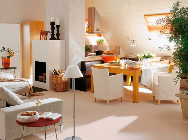 Interior design attic
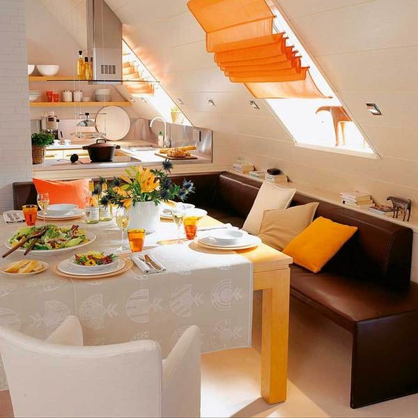 An orange curtain is a bright accent in the interior.The specifics of roof windows (slanted position) dictate the style and method of fastening curtains. Here, the most suitable was the universal design of the Roman blind. The fabric, sliding along the guides, gathers into neat folds. Kitchen "Faktum" (IKEA, Sweden), pendant lamp Occhio (Anta, Germany), table and chairs (Marktex, Germany), sofa Together (Walter Knoll, Germany).
Optimist's kitchen
When located directly above the kitchen sinkwindow, washing dishes from the most boring activity turns into an interesting pastime. The flow of light from the opening, located almost "at the zenith", can be quite intense. For this case, blinds are provided. In the evening, it makes sense to additionally illuminate the kitchen work area. In our case, sconces with directional light were used. The combination of bright green and red is rarely seen in painting (many artists consider it vulgar), but it is found everywhere in nature. It seems that nature does not care about the opinion of the masters. So our designer took a watermelon as a role model. Delicious and beautiful - what could be better for the kitchen? In the complex space of the attic, the principle of placing color accents is also observed. Bright and dark horizontals are located below the level of human eyes, almost at the floor, and the ceiling and walls are designed in light colors.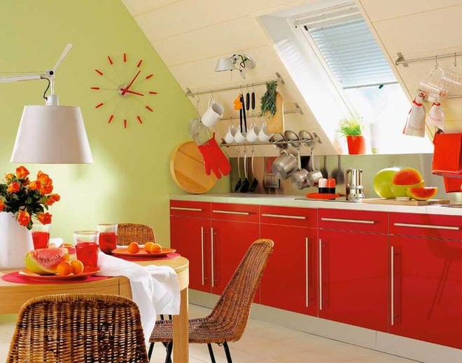
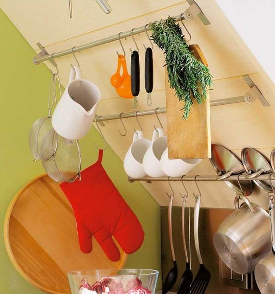 The simplest device for storing kitchen utensilsutensils - rods with hooks. Everything you need is at hand, and there is no need to equip a special dish dryer. Kitchen "Factum", Rellings (IKEA, Sweden), chairs (Lambert, Germany), table and clock (Habitat, UK), lamp (Artemida, Germany), blinds (Teba, Germany).
Summer colors
The inhabitants of this attic are lucky.At the end of the room there is a so-called French window, that is, in fact, a balcony door with a lattice fence on the facade of the house. This window improves the insolation of the room, and there are no problems with the selection of curtains. The interior design would not stand out in any way if not for the color scheme. It seems that the starting point was a picture hanging on ... the ceiling (note that the border between the ceiling and the walls in the attic is erased). Shades of bright green and yellow (cabinet fronts and carpet) create a light and joyful mood. White was chosen as the main background (ceiling, walls, floor, upholstered furniture). Active use of glass and metal (steel and polished aluminum in furniture elements and accessories), laconic forms give the room a modern look. This solution is ideal for a small space.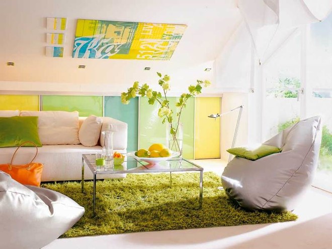
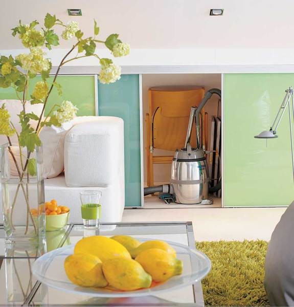 Low cabinets along the wall not onlydecorative, but also functional. They can be used to store, for example, household appliances, folding chairs and many other useful things. The material for the sliding doors is glass, onto which a multi-colored film is glued. Sofa (Brühl & Sippold, Germany), table (BoConcept, Germany), floor lamp (Luceplan, Italy), built-in lamps (Brumberg, Germany), vase (Habitat), carpet (Vorwerk).
Our carpet - flower meadow
Playful pop art keeps designers busy.For some reason, this style has been relevant for many years. Probably because it is light, allows for a “wild” mix of bright, sometimes acidic colors and a careless attitude towards design authorities. Along the entire low wall of this attic, there is a rack for books, disks and audio equipment. Its front is originally decorated with a chipboard panel, in which windows are cut out, reminiscent of portholes. There are no right angles here. The tables-stools have smooth rounded shapes, the sconce lamp is fancifully curved on a flexible “stem”. A round wicker basket chair is suspended on cables from the ceiling, which makes it look like a hammock. It hovers above the pink and green carpet, as if above a forest glade. But with all its color extremity, the interior creates a feeling of calm and tranquility.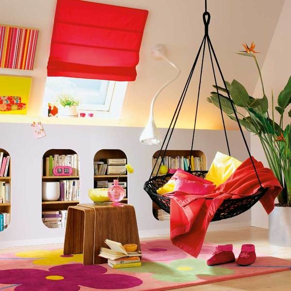
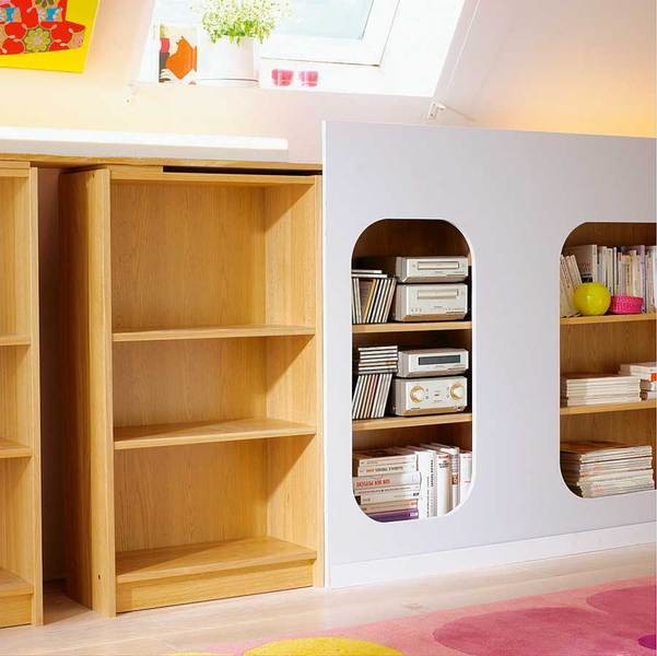 The dimensions of the decorative panel were specially madesuch that it protrudes 15 cm above the upper plane of the rack. This made it possible to build in lighting behind the ledge. The lamps themselves are not visible, but in the evening the room is illuminated with a soft, warm glow. Table, hammock (Habitat), lamp (Artemida), carpet (Vorwerk), curtains (Crèation Baumaun, Germany). Read more: how to weave
