 Beautiful lettering beautiful font
 Letters in the interior
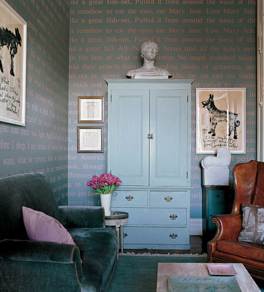
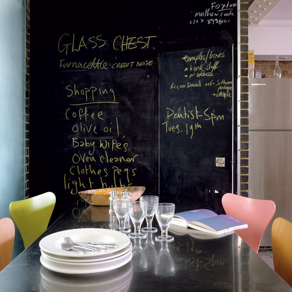
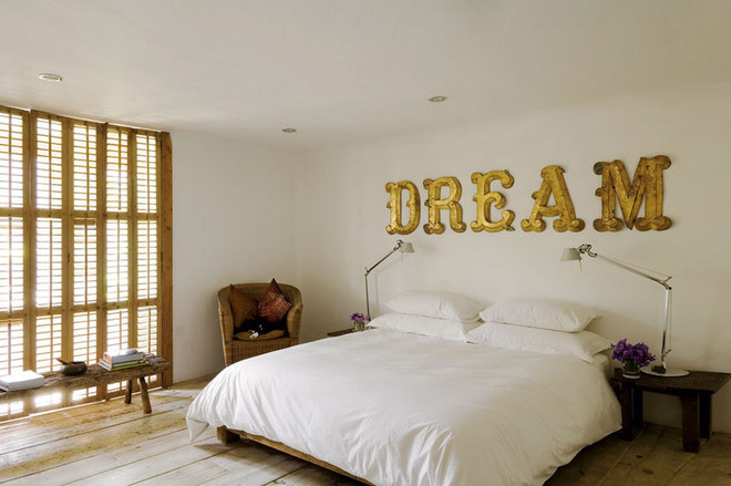 Photo №1 Quotes from favorite books, stuffed onstenciled walls - what a decoration for a library or study. It is important that the chosen font stylistically matches the interior. For a space decorated in a classic style, the respectable Times is ideal. Photo - 2 An option for those who prefer practical notes to abstract inscriptions and thoughtful quotes. On a slate board, you can jot down a list of good deeds for the weekend, write down a new dish or confess your love (or hate) to your husband. The beauty of such decor - in the possibility of constant renewal. And then, this is handmade, which is valued like nothing else these days! By the way, it would not hurt to install the same boards on the walls of architectural monuments - as an anti-vandal measure. Photo - 3 A popular decorating technique: a large laconic inscription - usually on bedding themes - at the head of the bed. In this case, we are called to close our eyes and immerse ourselves in the world of dreams.
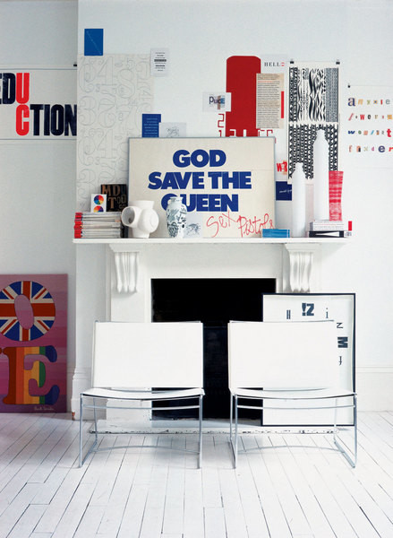
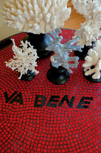
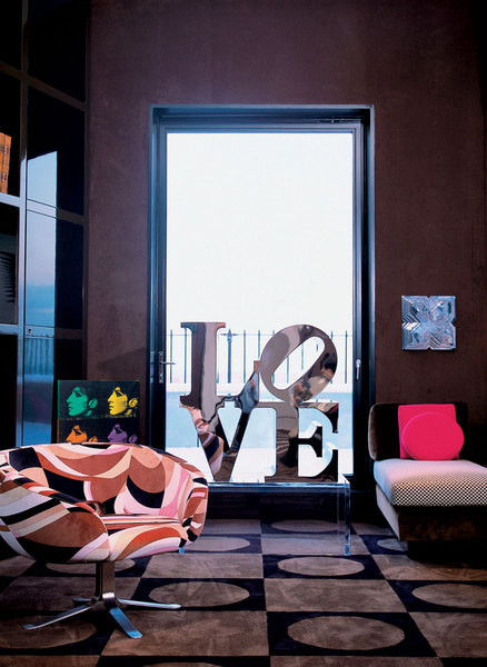
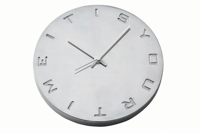
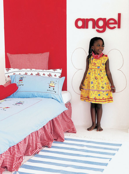 Photo №1 What isn't here!Samples of fonts of all kinds, posters, panels by Paul Smith Love, art exhibition catalogues, postcards, vases. And everywhere: letters, letters, letters... Due to such abundance, it is unrealistic to delve into the essence of all the inscriptions. Only one is clearly readable: "God save the queen". But this is not a manifestation of loyal feelings, but a poster of the Sex Pistols. If you want to arrange something similar in your home, keep two things in mind. First, to prevent the letters from merging into a mess completely, place them on a simple, monochromatic background. Ideally, white. Second, concentrate the letters on one wall, otherwise the room will look like a typographer's workshop. Photo - 2 Before you is a coffee table belonging to incorrigible optimists. The mosaic inscription reads: "Everything is fine!" No comments needed. Photo #2116;3 A beautiful font can be a real work of art. This became clear during the reign of pop art. Robert Indiana's sculpture Love speaks of love exclusively through letters. If you are going to reincarnate the 60s style in your interior, you cannot do without such art objects. Photo #2116;4 The interior of this children's room is romantic and ironic at the same time. The bed linen is responsible for the romance, the inscription Angel and the wings painted on the wall are responsible for the irony; the owner of the room, not without slyness, tries on the image of an angel. The bridge connecting these "two worlds, two childhoods" is the red wall at the head of the bed. It proves that the color " It is a great power that helps to easily combine the incompatible.
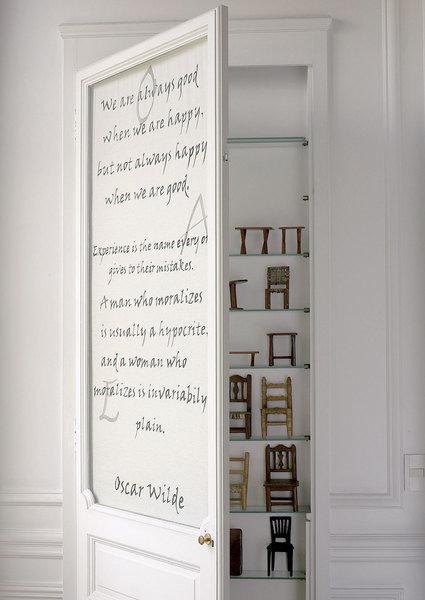
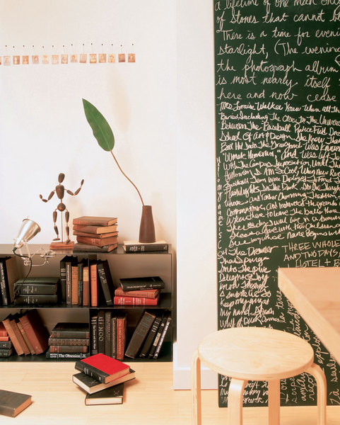
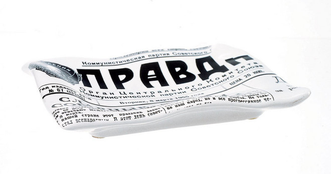
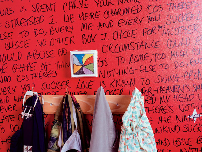 Photo №1 This door is decorated with a quote fromOscar Wilde. The text is handwritten - it is immediately obvious that the owners of the house have gone through it and are ready to sign under every word. The door leads practically to nowhere - behind it is a shallow niche with a collection of miniature chairs. This whole composition looks so intimate that, looking at it, you feel like an involuntary witness to something that is not actually intended for strangers' eyes. Photo - 2 Creative disorder on the bookshelves, a metal lamp, a simple wooden table, a stool from IKEA - it is immediately obvious that the owner of this room is a serious person, completely immersed in work and not accustomed to wasting time on nonsense. The slate board also clearly appeared here for a reason, but for a reason. Which, however, did not prevent it from becoming a modest but expressive decoration of the office. Photo №3 This hallway brings to mind the corridors of Soviet communal apartments, the walls of which were covered with telephone numbers. However, judging by the fragments of text that were captured by the camera lens, close physical contact is preferred to telephone conversations here. Before us is a text from the category «not recommended for children under 16». This is a harsh, shocking decor: the inhabitant of the house opens his soul to us right from the threshold.
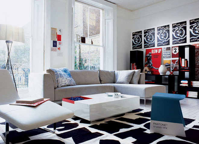
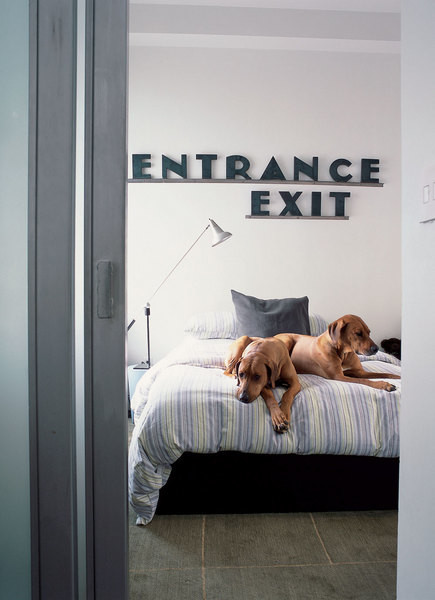
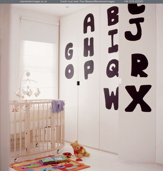
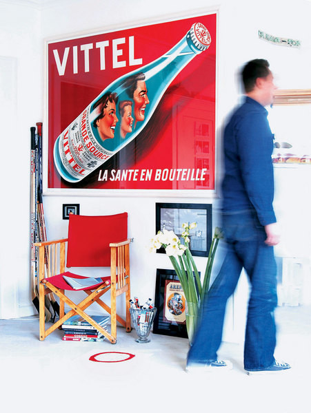
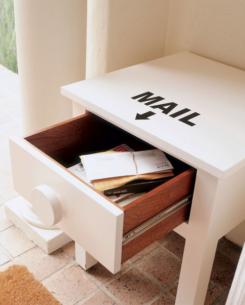 Photo №1 Most often, fonts play inin the interior, but here the whole intrigue is twisted around them. The total dominance of letters justifies the restrained color scheme: black, white and red prevail in the room. This classic combination, as well as a row of identical posters along the wall, organize the space. Photo #2116;2 Above the bed there is an inscription of two words: "entrance" and "exit". What the author wanted to say with this work is absolutely unclear. Was he hinting that this bedroom is a "walk-through yard"? Or did he offer his own version of the rhyme "There and back and forth. It's nice for you and me". We can only guess. And draw our own conclusions: when choosing an inscription for the interior, remember that a word is not a sparrow. Once it flies out, you can't catch it. Photo #2116;3 A great example of how to make a child's room interior touching and funny without resorting to the services of plush bunnies. The alphabet "AB" painted with a wide brush dilutes the boring surface of the built-in storage system. This is not only decorative, but also an excellent pedagogical technique that will help the young owner of the room master the alphabet. Photo #2116;4 Remember how the heroes of the novel "One Hundred Years of Solitude" suffered from total amnesia and, in order not to lose touch with reality completely, they began to sign everything around them? This technique is often used by decorators who are of sound mind and memory. Firstly, because a large beautiful font will decorate even the most banal object. Secondly, because it really is easier to remember where and what is. For example, letters are stored in this box.

Making Money with Desserts: Success Stories
Evgeniya Polischuk (Fedutinova) instagram:@evgeniyafedutinovavk.com/janeshomebaking– It all started with baking for family and friends. Gradually, I started posting photos of my baked goods on Instagram – and orders started coming in. I made my first custom-made cake on October 13, 2014, and a little earlier I started making macaroons and cupcakes. You could say that the business “found me”, I am very […]

Soups are cold recipes with photos
Cold cucumber soup with yogurt and lemonsorbet from the chef of the restaurant La Taverna Alexander Zhurkin Photo: Getty Images Ingredients: Plain yoghurt – 125 g Cucumber – 150 g Lemon/lime sorbet – 50 g Cocktail shrimp – 24 g Fresh ginger juice – 1 g Lime juice – 5 g Fresh orange juice – 5 g Parsley – 1 g Pink pepper – 1 g Watercress – […]

barbeque kebab
Pork tenderloin in glaze Photo:Dmitry Bayrak/dbstudioPreparation time: 20 minutes + marinating time.Calories: 454 kcal per serving.For 4 servings: 4 pork tenderloins (approximately 300 g each), 1 onion, 2 cloves of garlic, 1 tsp. lemon zest, 1 tsp. lemon juice, a pinch of ground cumin, coriander and turmeric, 1 tbsp. vegetable […]

Pierre Duacan: dietary recipes: Ducane diet
Beetroot soup Photo:Season’S, Luxury Hotels RepresentationYou will need:· Boiled beetroot – 60 g· Fresh cucumbers – 20 g· Red radish – 20 g· Green onions – 10 g· Egg – 1 pc.· Drinking mineral water – 200 g· Salt – 1 gPreparation:· Boil the egg and beetroot.· Grate the cucumbers, radish and part of the beetroot. Put everything […]
